
Like PNA, the Southern Annular Mode (also known as the Antarctic Oscillation) is considered random, or at best a teleconnection from some other index. I assume the annular in the name pertains to the dipole between the Antarctic core blob and the quasi-annular belt or ring around it. The SAM itself quantifies the north-south movement of this wind belt away from its normal location. The data goes back to the late 1950’s
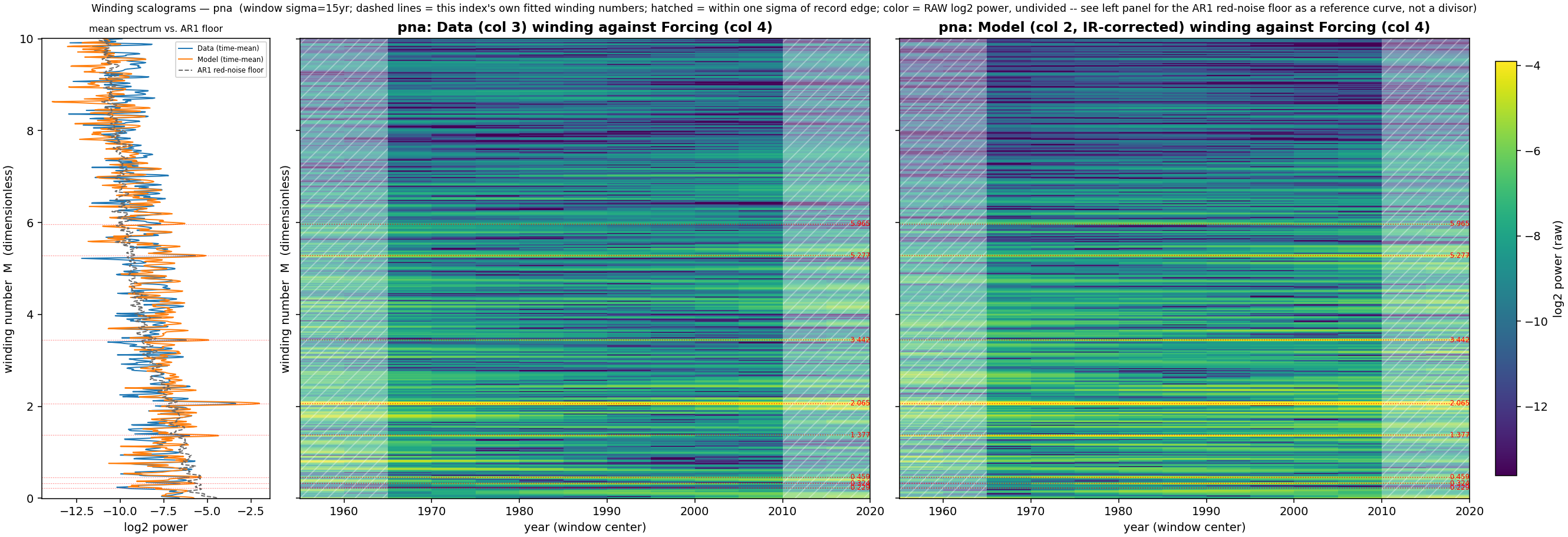
The other relationship to the PNA is that the strong winding in the SAM scalogram map is to the same harmonic using the same manifold (PNA winding scalogran here). That is the yellow line labeled (in red) 2.065 in the chart below. I am certain that the PNA and SAM time-series show no temporal correlation (double checked, see footnote1), so this winding is likely the common-mode basis between them, again strengthening the idea that the windings are global wavenumbers, perhaps related to the spherical harmonic expansion.

The time-series model fit is below. There is some overfitting in the test region but this is mainly time jitter

A companion test is to look at an SST region sensitive to tides near to the SAM annular region — the Patagonia Shelf quad:
![World map highlighting the location kS040_W050 within the coordinates [-50..-30° latitude, -60..-40° longitude] marked by a red rectangle and a dot.](https://i0.wp.com/geoenergymath.com/wp-content/uploads/2026/09/image-53.png?ssl=1)
For the winding scalogram you can see the same yellow ridge at 2.07. Use the spectrum on the left to help locate it — a strong peak that extends right.

The CV test region is qualitatively better here as it tends to less time jitter on the peak and valley locations.

The Patagonia Shelf SST in fact does correlate with the SAM index. The correlation coefficient is 0.32 with the SST including a trend value.

Footnotes
- Below is a time-series comparison between SAM and PNA, correlation essentially zero ↩︎
