Like PNA, the Southern Annular Mode (also known as the Antarctic Oscillation) is considered random, or at best a teleconnection from some other index. I assume the annular in the name pertains to the dipole between the Antarctic core blob and the quasi-annular belt or ring around it. The SAM itself quantifies the north-south movement of this wind belt away from its normal location. The data goes back to the late 1950’s
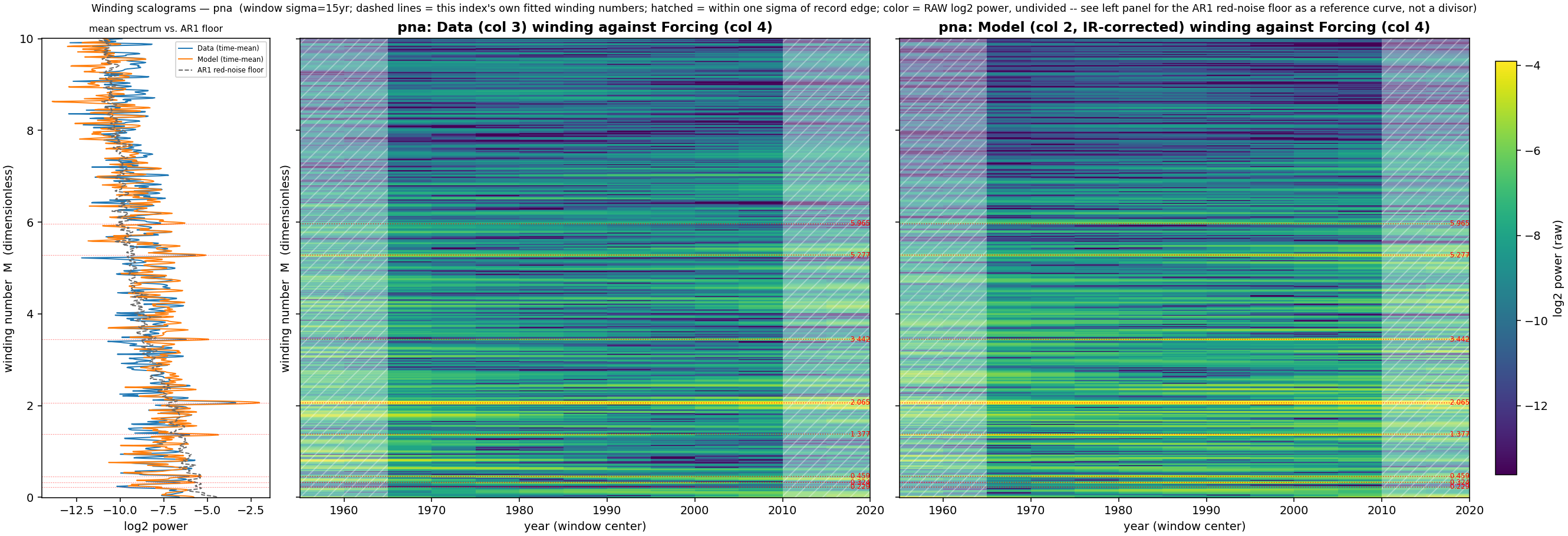
The other relationship to the PNA is that the strong winding in the SAM scalogram map is to the same harmonic using the same manifold (PNA winding scalogran here). That is the yellow line labeled (in red) 2.065 in the chart below. I am certain that the PNA and SAM time-series show no temporal correlation (double checked, see footnote1), so this winding is likely the common-mode basis between them, again strengthening the idea that the windings are global wavenumbers, perhaps related to the spherical harmonic expansion.
The time-series model fit is below. There is some overfitting in the test region but this is mainly time jitter
A companion test is to look at an SST region sensitive to tides near to the SAM annular region — the Patagonia Shelf quad:
For the winding scalogram you can see the same yellow ridge at 2.07. Use the spectrum on the left to help locate it — a strong peak that extends right.
The CV test region is qualitatively better here as it tends to less time jitter on the peak and valley locations.
The Patagonia Shelf SST in fact does correlate with the SAM index. The correlation coefficient is 0.32 with the SST including a trend value.
Footnotes
Below is a time-series comparison between SAM and PNA, correlation essentially zero ↩︎
The chart below is a fit to a Kaplan SST quad using an LTE solution described in Chapter 12 of Mathematical Geoenergy1. It may sound odd or counter-intuitive that the tides of an LTE formulation can impact temperature, but once you understand that most of the heat redistribution comes from mixing and upwelling of surface waters, then you realize the sources of forcing are limited — available from tides, winds, Coriolis effect, diurnal/seasonal cycles.
The region under study is the Kaplan SST quadrangle centered at 20°N, 50°E (10°N–30°N, 40°E–60°E), covering the Red Sea, the Gulf of Aden approach, the Persian Gulf, and the Gulf of Oman. Two narrow, sill-bounded straits gate exchange with the open ocean at either end of this box: Bab-el-Mandeb (Red Sea ↔ Gulf of Aden) and the Strait of Hormuz (Persian Gulf ↔ Gulf of Oman). This geometry — two shallow, evaporation-dominated seas each choked to the open ocean through a single narrow gap — is what makes the region interesting both to GEM-LTE‘s analysis and, independently, to a detailed basin hydrodynamics, which I won’t do but will cite later. Recall that the northernmost point of the Persian Gulf is one of the most unsurvivable parts of the world when it comes to heat index (and what is in store with global warming).
Red Sea / Persian Gulf Basin: a GEM-LTE case study
We look at this region in two passes — first a 1950–2023 fit, then the full 1856–2023 span.
1950+ model
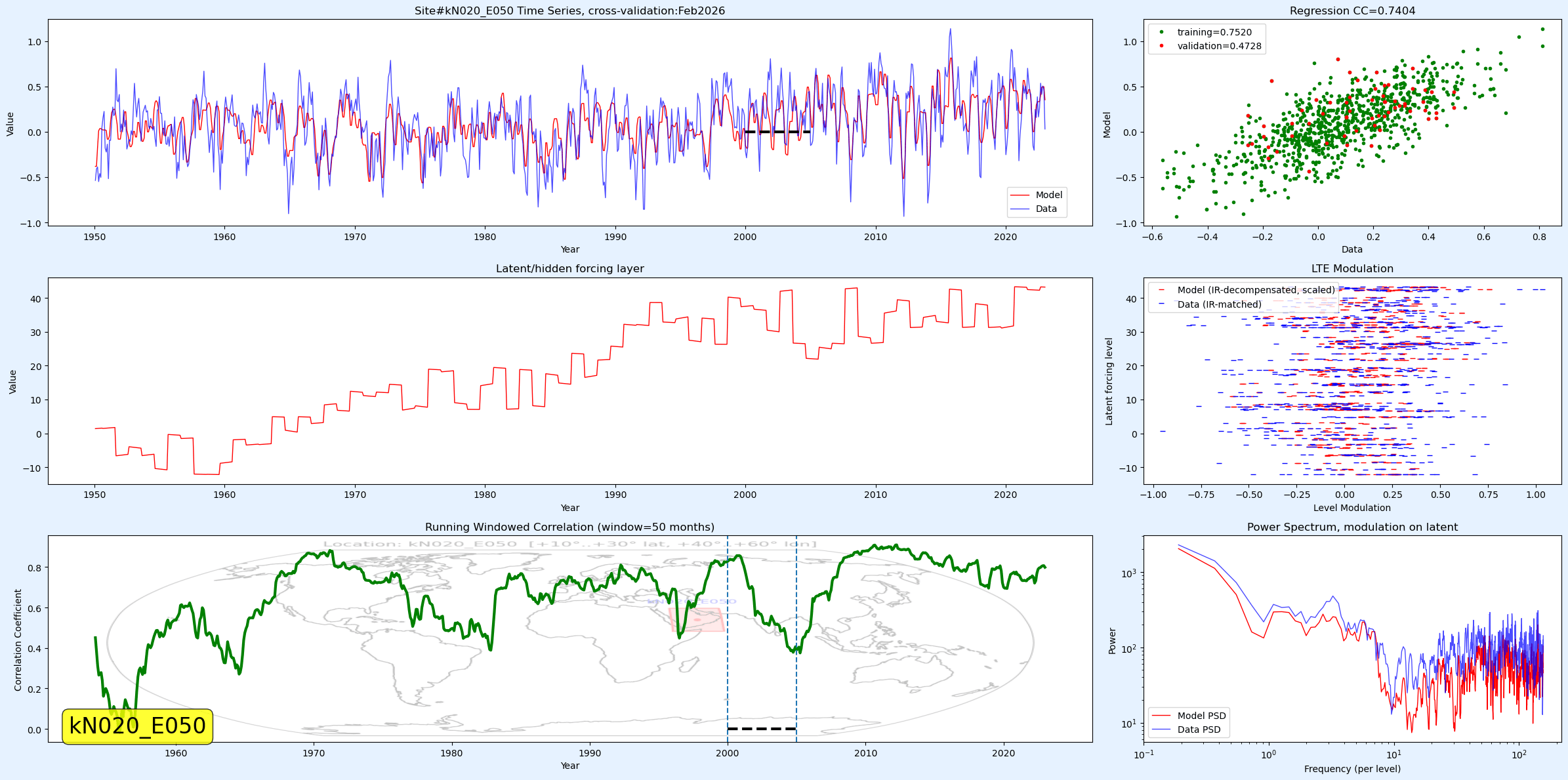
From the PSL.NOAA.gov (N 20 E 50) we fit monthly Kaplan SST (877 points, 1950.0–2023.0) against GEM-LTE’s tidal forcing manifold with a held-out region 2000–2005 used only for post-hoc validation. The current production fit reaches r ≈ 0.74 data-vs-model correlation over the full 877-month span. That’s the chart at the top.
As stated, the region 2000–2005 was withheld from training, and the rolling-window correlation in the top chart dips specifically in the untrained gap and recovers immediately on both flanks (r ≈ 0.75 before, r ≈ 0.84 after) — the textbook signature of a genuine, non-leaking blocked holdout. It still looks good.
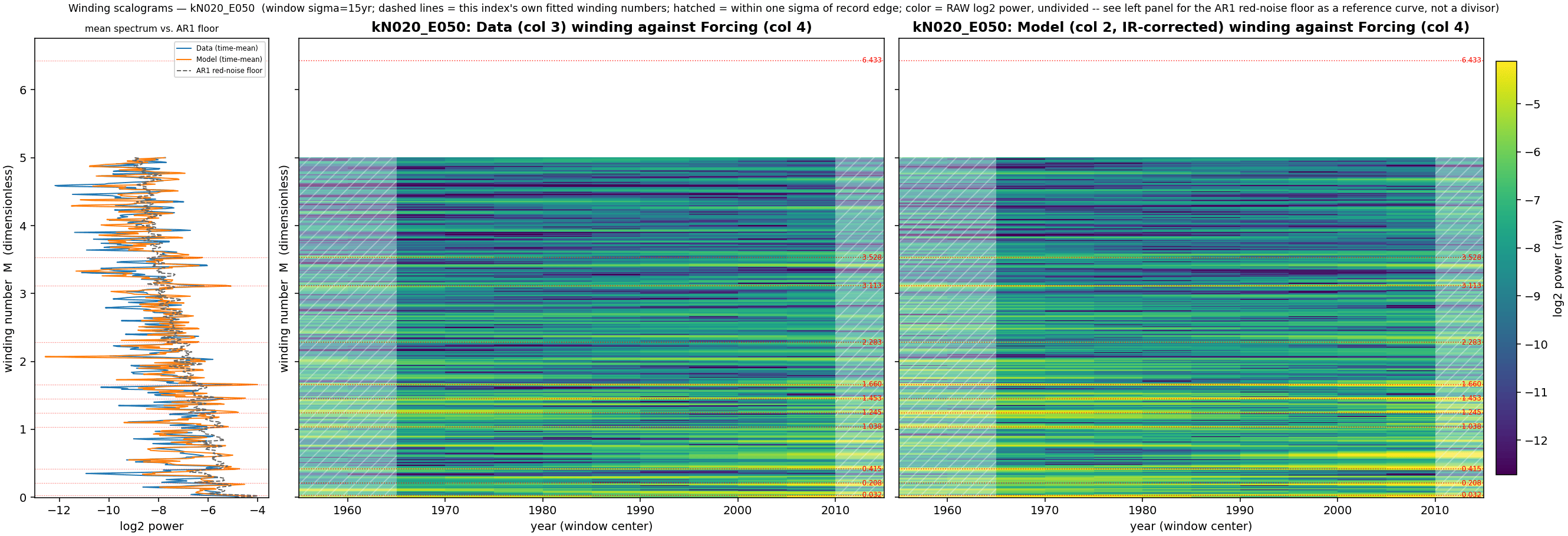
Winding structure
Every GEM-LTE index in this project shares one universal, spatially uniform global fundamental “backbone” term — and the Red Sea/Persian Gulf box is no exception: the same LOD calibrated forcing with a phase modulation term found independently in AMO, PDO, NAO, PNA, Baltic, etc. a common value (all 0.207–0.208). What distinguishes this region is the density of harmonics riding on top of that fundamental backbone — including [2, 5, 6, 7, 8, 11, 15, 17, 31], and several of the resulting winding rates (≈1.66, 1.87, 2.28, 2.90) show large, well-fit amplitudes with no analog in most other quads. Also have looked at the Gulf of Mexico and Aegean/Black Sea quad (as an aside there are distinguishable harmonic fingerprints between the Aegean and Black Sea just like there might for the Red Sea vs Persian Gulf, see more below).
Temporal power spectrum
A standard calendar-time periodogram (power_spectrum.py, AR(1) red-noise floor, 200 surrogates) gives a complementary view to the the forcing-domain winding scalogram above. The scalogram shows dense, persistent ridge structure across essentially the whole record; the plain frequency-domain view shows the model’s fidelity to the real data is spread out in several bands:
band (cyc/yr)
data’s share of its own variance
model/data power ratio
0.05–0.30 (multi-year)
0.225
0.52
0.30–0.70
0.146
0.37
0.70–1.30 (annual)
0.271
0.53
1.30–2.50
0.158
0.36
2.50–4.00
0.072
0.08
4.00–6.00 (sub-5-month)
0.041
0.06
According to the power spectrum below, the model isn’t capturing much of the signal faster than semi-annual.
Isolating just the model’s explicit seasonal regression terms (ann & sem — a fixed 1×/2× per-year sin/cos basis) and comparing their own peak-to-peak excursion against the real data’s 1.0-to-(-1.0)-scale excursion confirms these terms together account for only roughly 10% of the real seasonal-cycle amplitude.
Having a subtle 10% annual cycle helps with the visual matching but the model capturing the erratic nature and having a strong cross-validation is the key finding.
The full 1856–2023 span
Kaplan SST’s ship-based (pre-satellite, pre-1950) coverage is patchy worldwide, but the Red Sea/Persian Gulf corridor is an exception: it has carried dense shipping traffic — and therefore dense ship-log SST sampling — since long before 1950, plausibly reinforced by Suez Canal traffic since 1869. That gives this region one of the longest trustworthy pre-satellite records in the whole 89-quad grid, and made it a natural candidate for a stationarity check that most other quads can’t support.
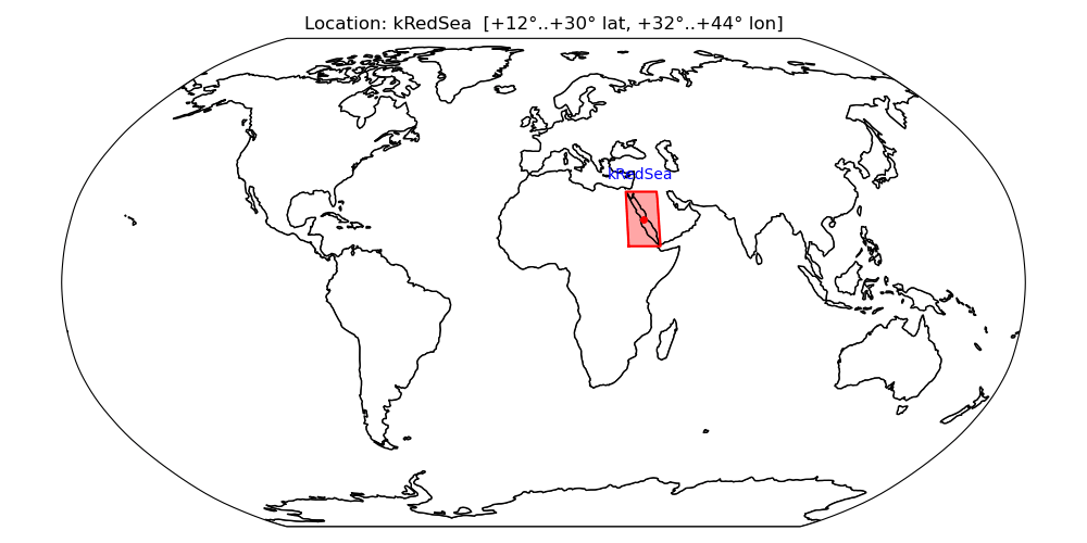
But to target the stationarity more precisely, I split that quad into a Persian Gulf area and a Red Sea area


![World map highlighting the location kS040_W050 within the coordinates [-50..-30° latitude, -60..-40° longitude] marked by a red rectangle and a dot.](https://i0.wp.com/geoenergymath.com/wp-content/uploads/2026/09/image-53.png?ssl=1)