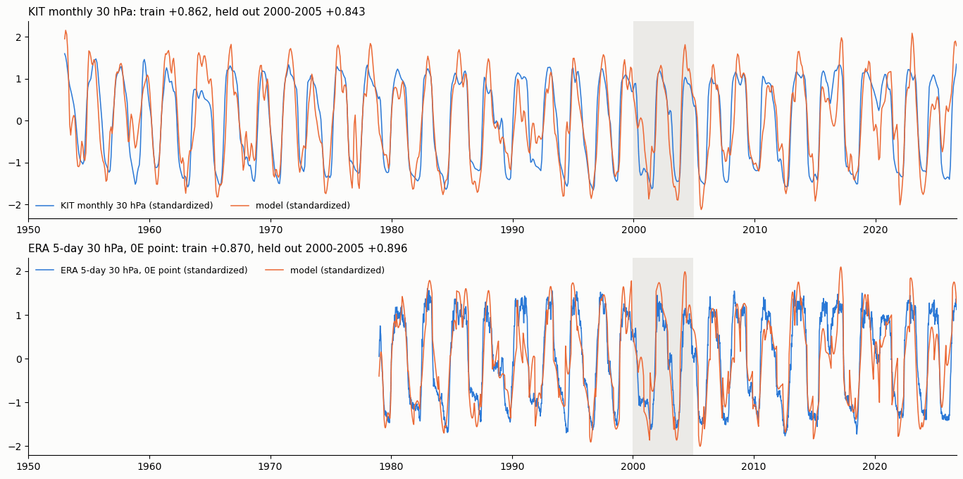
At some point we will realize that the decision to track climate data at monthly intervals was short-sighted. At monthly intervals way too much valuable information is either completely hidden or obscured by aliasing of that period with coinciding climate cycles.
In fact, if finer resolution data is available, models with richer detail are possible. Data scientists should not bury that detail by using filtering to rationalize their own lack of skill (“I can’t figure this out so many if I filter it something else might jump out:“) but need to attack it head-on.
Case in point: QBO
Copernicus maintains high resolution ERA reconstructions for QBO data. We can use an N-legged optimized fitting procedure to model simultaneously both daily time-series and monthly time-series for the 70 hPa altitude. Below are the results for a 2-legged (daily in the upper pane, and monthly in lower) each featuring an excluded hold-out interval used for testing.

Note that the hi-res fit features rapid cycles that are clearly revealed both in the data and model. In contrast, the lower monthly model requires filtering to smooth out these cycles, which are removed from the data via any monthly averaging.
Similarly for the 50 hPA of QBO1

Neither of these were fit alone (monthly only here) but simultaneously, taking advantage of the longer time series interval of the monthly data, and the fine resolution of the daily data.
Next case: SOI
I first looked at the high-resolution SOI data in 2019, presenting preliminary results at the AGU. The rapid cycling in SOI data is likely a real ENSO-related property as the +/- dipole is optimized if the Darwin is shifted another 12-13 days from Tahiti2 — something that is possible only with the fine resolution of the daily results (extending back to 1991 from an Australian climate site).
The simultaneous fit shown below includes a 1991-2005 training interval in the daily (leg 1 – upper pane) together with the much longer monthly time series that excludes this region (leg 2- lower pane)

Below is a fit based on Darwin and Tahiti isolated and then combined and optimized along with the 5-day

The SOI model is built on the foundation of a common manifold that relates NINO4, PDO, AMO, and IOD-East, shown below

The common manifold is mapped to the measured index by a set of LTE harmonics, with weighting unique to the basin

These four indices are then superimposed via multiple linear regression (including a linear term for AGW) to approximate global SST

Nothing truly new here, as the essential innovative model has been described in Mathematical Geoenergy3. This work is just digging deeper. As often occurs, difficult problems seemingly immune to solution only require fresh or parallel perspectives. Here, the insight arrives from elsewhere to get the framing right — applying a common manifold and mixing in the cross-validation and signal processing techniques. Lean on the metrology, i.e. consider ALL measurements available) and rely on comprehensive booking.to do the rest. Would this model have been found sooner if we relied more on the detailed model? We’ll never know.
Has this happened before? Consider this classic example relating to metrology: For centuries, determining longitude at sea was considered one of the great unsolved problems – so hard that England created the Longitude Prize in 1714.. Now it’s considered a trivial solution. Hint: People thought it involved precise measurements of the moon’s location in the sky coupled with complex calculations.
BTW, that longitude prize was likely worth over $4 million in today’s dollars, and the winner took a while to collect and apparently didn’t get all the money awarded. Solution4
Footnotes
- QBO model fit at 30 hPa shown below ↩︎
- The Madden-Julian Oscillation (MJO) likely shows a similar shift, ~21 days as described in this post: The MJO ↩︎
- P. Pukite, D. Challou, and D.Coyne, Mathematical Geoenergy, (Wiley, 2018), https://agupubs.onlinelibrary.wiley.com/doi/book/10.1002/9781119434351 ↩︎ ↩︎ ↩︎
- Better precision ship-board clocks/chronometer .. The solution was absurdly simple, keep the clock synched/calibrated to Greenwich time and then reference the ship’s local solar noon to this time knowing how fast the Earth revolves. IOW meticulous bookkeeping and superior metrology ↩︎