CO2 Outgassing Model (αβ)

This is one of the most interesting things I have done in a few weeks.

I am always motivated to find simple relationships that expose the seeming complexity of the climate system. In this case it involves the subtly erratic behavior observed in paleoclimate temperature versus CO2 data. The salient trends are there, in that CO2 and Temperature track each other, but the uncertainties cause climate watchers some puzzlement. The following tries to put a model-based understanding to what I think is happening. As usual, this does not rely on detailed climate models but simply pragmatic physical considerations placed in a mathematical context.

Premise. A model of long-term global temperature and CO2 interactions would assume two primary contributions.

First, we have the forcing function due to the greenhouse gas properties of atmospheric CO2 concentrations, where c = [CO2] is in parts per million (PPM). The first-order paramater alpha, α, is known as the climate sensitivity and is logarithmic with increasing concentrations (log=natural log): $$ \Delta T = \alpha \log {\frac{[CO_2]}{C_0}} $$ The second contributing factor is due to steady-state outgassing of CO2 from the ocean’s waters with temperature. A first-order approximation is given by the Arrhenius rate law to estimate gaseous partial pressure. The standard statistical mechanical interpretation is the invocation of a Boltzmann activation energy to model the increase of steady-state pressure with an increasing temperature bath. $$ p = p_0 e^{\frac{-E_a}{kT}} $$ To keep things simple we use the parameter beta, β, to represent the activation energy in Kelvins, where k is Boltzmann’s constant. The relation between Kelvins and electron volts is 11600 Kelvins/eV. $$ \beta = \frac{E_a}{k} $$ $$ p = p_0 e^{\frac{-\beta}{T}} $$ This works very well over a reasonable temperature range, and the activation energy Ea is anywhere between 0.2 eV to 0.35 eV. The uncertainty is mainly over the applicability of Henry’s law, which relates the partial pressure to the solubility of the gas. According to a Henry’s law table for common gases, the CO2 solubility activation energy is β = 2400 Kelvins. However, Takahashi et al (see reference at end) state that the steady state partial pressure of CO2 above seawater doubles with every 16 celsius degree increase in temperature. That places the activation energy around 0.3 eV or a β of 3500 Kelvins. This uncertainty is not important for the moment and it may be cleared up if I run across a definitive number.

Next, we want to find the differential change of pressure to temperature changes. This will create a limited positive feedback to the atmospheric concentration and we can try to solve for the steady-state asymptotic relationship. The differential is: $$ d[CO_2] \sim dp = \frac{\beta}{T^2} p dT \sim \frac{\beta}{T^2} [CO_2] d\Delta T $$ In terms of a temperature differential, we invert this to get $$ d\Delta T = \frac{T^2}{\beta [CO_2]} \Delta [CO_2] $$ Now we make the simple assertion that the differential changes in temperature will consist of one part of the delta change due to a GHG factor and another part due to the steady-state partial pressure. $$ d \Delta T = \frac{\alpha}{[CO_2]} d\Delta [CO_2] + \frac{T^2}{\beta [CO_2]} d\Delta [CO_2] $$ We next cast this in terms of a differential equation where dc=d[CO2] and dT = dΔT. $$ \frac{dT(c)}{dc} = \frac{\alpha}{c} + \frac{T(c)^2}{\beta c} $$ The solution to this non-linear differential equation is closed-form. $$ T(c) = \sqrt{\alpha\beta} \tan{\sqrt{\frac{\alpha}{\beta}\log{c} + K_0}} $$ The interpretation of this curve is essentially the original activation energy, β, modified by the GHG sensitivity, α. The constant K0 is used to calibrate the curve against an empirically determined data point. I will call this the αβ model.

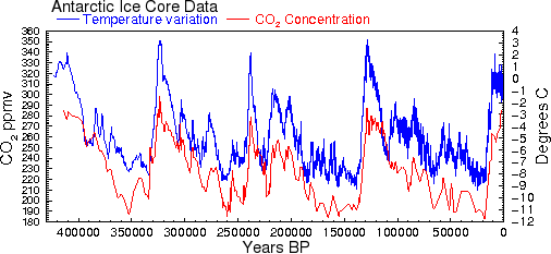
Application. We can use the Vostok ice core data to evaluate the model. My previous posts on Vostok introduced the CO2 outgassing concept and evaluated a few random walk simulations. The following figure gives an idea of the raw data we are dealing with and the kind of random walk simulation one can generate.

The key I think is to understand the seemingly random limit cycles of the atmospheric CO2 concentration with temperature. This is seen with the following graphs, reproduced from the earlier post:

The αβ model asymptote would at best draw a line through the space and couldn’t explain the cloud of uncertainty (i.e. covariance) relating CO2 to Temperature.

To run a simulation,we need to establish a working temperature range, as the absolute temperature is required for the αβ model. Realizing that the actual Vostok temperature range was not known but the relative temperatures were available, I took an arbitrary starting point of 288 K (corresponding to a temperate or warm region). Some value is needed since a T^2 factor plays into the model. Placing the value 50K less will not change the interpretation.

Further, it is clear that a lag between Temperature changes and CO2 changes exists. Historically, there is little evidence that large scale CO2 changes have been the forcing function and something else (i.e. Milankovitch cycles) were assumed to kick off the climate variation. The lag is likely most noticeable on temperature decreases, as it is understood that the long adjustment time of atmospheric CO2 to sequestration is a critical and significant aspect to transient climate sensitivity.

The following figure illustrates both the steady-state αβ model and a lagged CO2 Monte Carlo simulation. The Monte Carlo random walk simulation simply integrates the d[CO2] and dΔT expressions described above, but on temperature decreases I introduce a lag by using the value of temperature from a previous step. This generates a clear lag on the trajectory through the phase space as shown in the following figure.

Another run shows a larger temperature excursion from the same starting point:

Without the introduced CO2 lag, the trajectory would simply follow the steady-state αβ curve, shown below. This is a sanity check that the Monte Carlo integration matches the analytical result as well. Note also that the following curve has a lower value of α.

If the value of α is very small, α=0.01 which corresponds to a very small GHG feedback, even with a lag then the variation of the temperature fluctuations are also reduced. The reason this happens is that the temperature acceleration due to the CO2 GHG positive feedback is reduced, and the lag has little effect on the small random walk disturbances from the steady-state values.

Finally, here is a set of 15 runs for the lagged, high-α configurations. Note that the random excursions match the empirical Vostok data remarkably well.

For the random walk, I have not introduced a reversion to the mean attractor as described in the Ornstein-Uhlenbeck post. This definitely limits the excursions to extending below the colder temperature regimes. For this set of simulations, I emulated that lower limit by assuming the initial stimulus was a positive temperature delta from the 288K starting point. The upper temperature regime is clearly limited by the Stefan-Boltzmann feedback, which is partly accommodated by the logarithmic climate sensitivity factor.

The simulations are very easy to do in a spreadsheet. I will try to create a Google Docs variation that one can interact with in this space. [I will also configure a scripted standalone simulator so that I can generate thousands of runs and accurately represent a 2D density plot — this will more clearly show the ΔT versus [CO2] uncertainty. see below]

I am more and more convinced that paleoclimate data is the best way to demonstrate a signature of CO2 on climate change, given the paucity of long time series data from the real-time telemetry and instrumentation era (view the CO2 control knob video by Richard Alley to gain an appreciation of this). I still won’t go close to applying current data for making any predictions, except to improve my understanding. Less than one hundred years of data is tough to demonstrate anything conclusively. The paleoclimate data is more fuzzy but makes up for it with the long time series.

Added 2D contour plots:

The background contour densities correspond to more probable state space occupation, assuming a start from the highest density point. Each was generated from a set of random walk simulations averaged over 1000 runs assuming an α value of 5 and a β value of 3500 Kelvins (i.e. Takahashi pCO2 doubling). The lower plot has a slightly lower β value of 3300 Kelvins and has a lag 2/3 smaller than the upper plot.

This is the simple random walk simulation source code that gets fed into gnuplot (corresponding to the lower figure).

   srand()
   RC = 0.5     ## Scale of hop
   a = 5.1      ## Alpha
   b = 3300.1   ## Beta
   f = 0.3      ## fraction of lag
   T0 = 290.9   ## start Temperature
   C0 = 226.1   ## start CO2
   loops = 1000
   while(loops–) { ## Number of runs
      T = T0
      lastT = 0.00001
      C = C0
      dT = (1.0+rand())*RC   ## Start Noise term
      dC = 0.00001
      i = 2000
      while(i–) {  ## Length of random walk sim
         dT0 = lastT
         dT1 = dT
         dC1 = dC
         dT = a*b*dT/T/T + (0.5-rand())*RC   ## Feedback+Noise
         if(dT1>0)
            dC = b*C*(f*dT+(1.0-f)*dT1)/T/T  ## Lead response
         else
            dC = b*C*(f*dT0+(1.0-f)*dT1)/T/T ## Lag response
         T += dT1
         C += dC1
         lastT = dT1
         ## Store random walk location
         Histogram[int(T),int(C)]++
      }
   }
   ## Collect statistics
   for(T=284;T<=298;T++)
      for(C=170;C<=300;C++) {
         if(Histogram[T,C]>0)
            print T “, ” C “, ” Histogram[T,C]
         else
            print T “, ” C “, ” 0
      }


References Takahashi, T; Sutherland, SC; Sweeney, C; Poisson, A; Metzl, N; Tilbrook, B; Bates, N; Wanninkhof, R; Feely, RA; Sabine, C; Olafsson, J; Nojiri, Y “Global sea-air CO2 flux based on climatological surface ocean pCO2 and seasonal biological and temperature effects” Deep-Sea Research (Part II, Topical Studies in Oceanography) [Deep-Sea Research (II Top. Stud. Oceanogr.)] 49, 9-10, pp. 1601-1622, 2002


Added per comment:

The following figure shows that Argon levels (the temperature proxy) lagging the CO2 levels .

from Caillon, et al, “Timing of Atmospheric CO2 and Antarctic Temperature Changes Across Termination III”
http://www.sciencemag.org/content/299/5613/1728.abstract


Seasonal Outgassing Model

What we also need is current data from both CO2 and sea surface temperatures (SST) to determine whether we can better calibrate the CO2 outgassing.

Both these sets have a monthly averaging.

Since the Mauna Loa CO2 shows extreme sensitivity to seasonal fluctuations, I culled the SST data to give the most regional sensitivity to the maximum excursion of CO2 levels. This likely corresponds to the latitudes of maximum temperature, which should give the maximum CO2 outgassing.  From the data, the maximally warm average SST exists at around -6 degrees latitude.

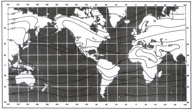
January Temperatures

July Temperatures

The next step was to take a spread of latitude readings +/- 15 degrees from the maximally warm latitude. That spread is somewhat arbitrary but it captures the width of the warmest ocean regions, just south of Hawaii. See the Pacific Warm Pool.

Both the CO2 and SST curves show a sinusoidal variation with a harmonic that generates a side hump in the up-slope, as shown below. 

The harmonic also shows up in the Fourier analysis of the CO2 data, which I fit to previously.

This time, instead of doing a Fourier analysis, I used the Eureqa curve fitting tool to extract the phase information from the SST and CO2 measurements. This is very straightforward to do as one only needs to copy and paste the raw time-series data into the tool’s spreadsheet entry form.

Letting the CO2 fit run in Eureqa results in this:

Letting the SST fit run in Eureqa results in this:

I chose the maximal complexity and lowest error result in both cases. Subtracting the trend and offsets from the fit, I was left with the yearly period plus one harmonic to reproduce the seasonal variations. Two periods of CO2 and SST variations are shown below:

Note how well aligned the waveforms are over the yearly cycle. The Mauna Loa measurements have a 0.04 period shift which is a mid-month reading, and I assumed the SST readings were from the beginning of each month. In any case, the lag from temperature variations to CO2 response has an uncertainty of around one month.

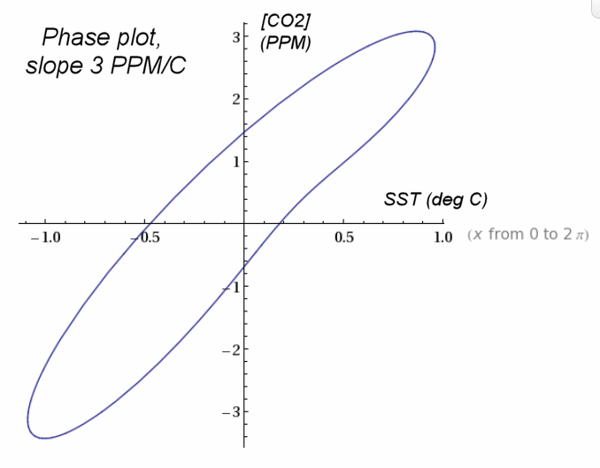
In the plot above, the SST readings were scaled by 3.2 to demonstrate the alignment. If we plot the phase relationship between SST and atmospheric concentrations, the transient scaling shows a slope of 3 PPM per degree C change. This is the transient outgassing relationship.

The transient outgassing is much less than the equilibrium number since the seasonal temperature variations prevent the partial CO2 concentration from reaching an equilibrium. So the [CO2] always reflects but slightly lags the current regional temperature as it tries to catch up to the continuously changing seasonal variations. This is the actual spread in the data, removing the lag:

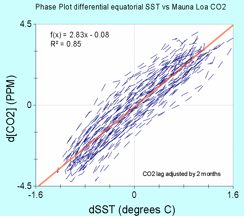
The cross-correlation function shows alignment with 12 month cycles, which is not surprising.

So this phase plot can be compared to the phase plots for the Vostok data, which show a much larger outgassing sensitivity exaggerated by the GHG positive feedback warming mechanisms. The Vostok plot gives a 10 PPM per degree change over the interglacial temperature range.

Added:

The following figure shows two theoretical phase plots for other common soluble gases, Argon and Nitrogen. This is taken from “Continuous Measurements of Atmospheric Ar/N2 as a Tracer of Air-Sea Heat Flux: Models, Methods, and Data” by T. W. Blaine.  Note the similarity to that for CO2. The thesis is highly recommended reading as it applies many of the same math analysis, such as the two harmonic fit.

A couple of Wolfram Alpha models for the phased response of [CO2] from a forcing temperature with gain of 3, and an anthropogenic [CO2] ramp included:

First-order response: x + (1/30) dx/dt = 3*cos(2*pi*t) + 2*t

Phase relation from the solution: plot cos(2 pi t) and (675 pi sin(2 pi t)+10125 cos(2 pi t))/(15 (225+pi^2))

The value of the normalized time constant (in this case 1/30) sets the width of the slanted ellipse. The smaller that value is, the narrower the ellipse becomes.

                                     ADDED 2013                                        

Using the SST data for latitudes -6 ±15 degrees, we can take the Mauna Loa CO2 data and subtract a factor of 3 PPM/deg C  after applying a lag of 1 month. This simple transformation completely removes the seasonal oscillations, leaving only noise and perhaps a few glitches related to El Nino events (see 1998-1999).

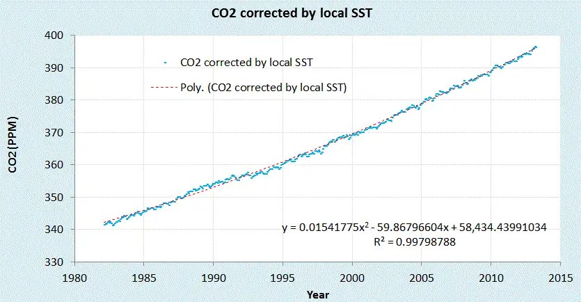
Corrected Mauna Loa CO2 data
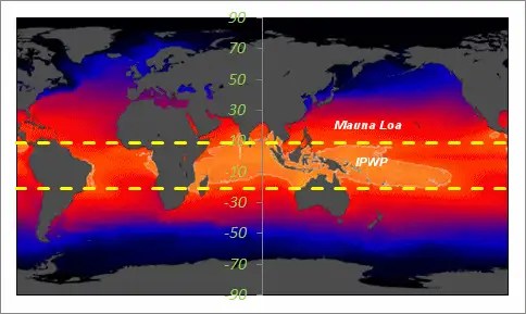
The Indo-Pacific Warm Pool (IPWP) lies within the +9N to -21S SST average

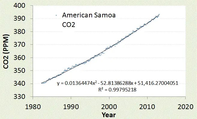
We can do the same for another CO2 reporting station in American Samoa.

American Samoa is located in the middle of IPWP (near the label in the map).
Very little fluctuation in CO2 is observed since the temperature is seasonally stable on that latitude.

This is the carbon emission data convolved with the CO2 sequestering Green’s function, sandwiched between the Mauna Loa and Samoa data. The carbon emission data is very smoothly varying after the convolution is applied so a very slight additional temperature-dependent CO2 outgassing based on filtered global SST is added.  This is slight as shown in the next graph.

If we take the residuals from the polynomial fitted curves (including one for the carbon residuals from the CDIAC, see chart above) we see how well the curves agree on a year-by-year basis.  All this really shows is that the residual is at best +/- 1 PPM which may be due to additional global SST variations (the yellow circles) but could also be any disturbances  (such as volcanic, biotic, wildfires, etc) as well as possible systemic (measurement) errors. 

Rainfall Variability Solved

I will preface this entry by suggesting that sometimes the statistics are so simple that they fall in your lap.

As a premise, we want to consider whether a simple stochastic model can generate statistical patterns of rainfall events.

We assume a maximum entropy probability distribution function which assumes an average energy of rainfall rate for a storm i:

$$ P(E \mid E_i) = e^{\frac{-E}{E_i}} $$

The rationale for this is that the rainfall’s energy is proportional to the rate of the rainfall, since that amount of moisture had to be held aloft by gravity.

$$ Rate_i \sim E_i $$

Yet we know that the Ei can vary from storm to storm, so we leave it as a conditional, and then set that as a maximal entropy estimator as well

$$ p(E_i) = \alpha e^{- \alpha E_i} $$

then we integrate over the conditional’s range.

$$ P(E) = \int_0^\infty P(E \mid E_i) p(E_i) \,dE_i $$

This results again in an integration formula lookup, which leads to the following solution:

$$ P(E) = 2 \sqrt{\frac{E}{\bar{E}}} K_1(2 \sqrt{\frac{E}{\bar{E}}})$$

where K1 is the modified BesselK function of the second kind, in this case of order 1, which is found in any spreadsheet program (such as Excel).

Note that this is the same function that we used last week for determining wind speed distributions and that we used in TOC to determine the distribution of terrain slopes for the entire planet as well!  Again this reduces to the simplest model one can imagine — a function with only one adjustable parameter, that of the mean energy of a sampled rainfall rate measurement. In other words the expression contains a single number that represents an average rainfall rate.  That’s all we need, as maximum entropy fills in the rest.

So let us see how it works.  The analysis was compared against this recent paper:
“Can a simple stochastic model generate rich patterns of rainfall events?” by S.-M.Papalexiou, D.Koutsoyiannis, and A.Montanari [2011] and graphed as shown below in Figure 1. The green points constitute the BesselK fit which lies right on top of the blue empirical data set.

Fig. 1: Cumulative rainfall distribution statistically gathered from several storm events.
The BesselK fit assumes a double stochastic process, a MaxEnt within a storm and a MaxEnt across the storms.

From the table below reproduced from the paper, we can see that the mean value used in the BesselK distribution was exactly the same as that from the standard statistical moment calculation

Event# 1 2 3 4 5 6 7 All
SampleSize 9697 4379 4211 3539 3345 3331 1034 29536
Mean(mm/h) 3.89 0.5 0.38 1.14 3.03 2.74 2.7 2.29
StandardDeviation(mm/h) 6.16 0.97 0.55 1.19 3.39 2.2 2 4.11
Skewness 4.84 9.23 5.01 2.07 3.95 1.47 0.52 6.54
Kurtosis 47.12 110.24 37.38 5.52 27.34 2.91 -0.59 91
HurstExponent 0.94 0.79 0.89 0.94 0.89 0.87 0.97 0.89

In contrast, Papalexio try to apply Hurst-Kolmogorov statistics to the problem in search of a power law solution. They claim that the power law tail of -3 is somehow significant. I would suggest instead that the slight deviation in the tail region is likely caused by insufficient sampling in the data set. A slight divergence starts to occur at the 1 part in 5,000 level and there are only 30,000 points in the merged data set, indicating that statistical fluctuations could account for the difference. See Figure 2 below which synthesizes a BesselK distribution from the same sample size, and can clearly duplicate the deviation in the tail.

Fig. 2: Monte Carlo sampling from a synthetic BesselK distribution reveals the same departure at low probability events.
Fluctuations of 1 in 30,000 are clearly seen at this level, so care must be taken to not read fat-tail behavior that may not exist.

Bottomline is that this simple stochastic model beats the other simple stochastic model, which doesn’t seem as simple anymore once we apply an elementary uncertainty analysis to the data.


Added:

For the moments of the Bessel K solution, assuming the mean of 2.29, we have standard deviation of 4.00, skew of 5.01, and kurtosis of 50.35. These map fairly well to the table above. The higher moments differ because of the tail difference I believe.

Interesting if we add another composite PDF to the BesselK then we get the Meijer G function:
$$\int_0^\infty 2 K_0(2 \sqrt{y})\frac{1}{y} exp(-\frac{x}{y}) dy = G_{0,3}^{3,0}(x | 0,0,0)$$

Fig. 3: PDFs of progressively greater scaling composition. Notice the gradual fattening of the tail.

As a summary, I made an argument based on observations and intuition that rainfall buildup is a potential energy argument. This translates to a Boltzmann/Gibbs probability with a large spread in the activation energy. The large spread is modeled by maximum entropy — we don’t know what the activation energy is so we assume a mean and let the fluctuations about that mean vary to the maximum amount possible. That is the maximum entropy activation which is proportional to a mean rainfall rate — the stronger the rate, the higher the energy That becomes the premise for my thesis, predicting the probability of a given rainfall rate within the larger ensemble defined by a mean. Scientists are always presenting theses of varying complexity. This one happens to be rather simple and straightforward. Papalexio et al, were on exactly the same track but decided to stop short of making the thesis quite this simple. They seem to imply that the PDFs can go beyond the BesselK and into the MiejerG territory, and beyond, of variability. That is fine as it will simply make it into a fatter tail distribution, and if a fatter tail matches the empirical observations on a grander ensemble scale, then that might be the natural process.

Wind speeds of the World

See if you can follow this argument for the neatest little derivation of a wind speed estimator. I believe that this thing can model the distribution of wind speeds over the entire planet.

In The Oil Conundrum, we modeled the wind speed for a single location over a span of time. This turned into a simple maximum entropy estimator, which assumed a kinetic energy for a wind volume

$$ E \sim v^2 $$

and then a probability distribution function which assumes an average energy over a region i:

$$ P(E \mid E_i) = e^{\frac{-E}{E_i}} $$

but we know that the Ei can vary from region to region, so we leave it as a conditional, and then set that as a maximal entropy estimator as well

$$ p(E_i) = \alpha e^{- \alpha E_i} $$

then we integrate over the conditional’s range according to standard practice.

$$ P(E) = \int_0^\infty P(E \mid E_i) p(E_i) \,dE_i $$

This results in a simple lookup in your favorite comprehensive table of cataloged integration formulas, which leads to the following solution:

$$ P(E) = 2 \sqrt{\frac{E}{\bar{E}}} K_1(2 \sqrt{\frac{E}{\bar{E}}})$$

where K1 is the modified BesselK function of the second kind, in this case of order 1, which is found in any spreadsheet program (such as Excel).

First of all, note that this is the same function that we used in TOC to determine the distribution of terrain slopes for the entire planet as well!  There, I took a slightly different route and derived it based on a cumulative probability distribution function (CDF) instead of a probability density function (PDF). No matter, in both cases it reduces to the simplest model one can imagine — a function with only one adjustable parameter, that of the mean energy of a sampled wind measurement. In other words the expression contains a single number that represents an average planetary wind speed.  That’s all we need.

So let us see how it works.

I used wind data from Bonneville Power Administration, which has over 20 meteorological stations set up around northern Oregon. The download consisted of over 2.5 million data points collected at 5 minute intervals, archived over the span of a little less than 2 years.

Fig. 1: Cumulative distribution function of wind energies from Bonneville with model fit.

I actually didn’t have to even vary the parameter, as the average energy was derived directly by computing  the mean over the complete set of data separately. This corresponded to a value of 12.4 MPH, and I placed a pair of positive and negative tolerances to give an idea of the sensitivity of the fit.

As this is a single parameter model, the only leeway we have is in shifting the curve horizontally along the energy axis, and since this is locked by an average, the fit becomes essentially automatic with no room for argument. The probabilities are automatically normalized.

I also show the log-log plot next, which reveals a departure at high wind speeds.

Fig. 2: Cumulative distribution function of wind energies on a log-log plot.
At large wind speeds, the fit diverges from the data as the peak 5-minute wind speed observed was 60 MPH.

I am not too worried about this slight divergence as it only shows that excessive gale force winds (greater than 60 MPH) did not occur over the extended region during a span of two years.  The next logical step is to average this over longer times and larger spatial regions.


I have to admit that this investigation into the Bonneville dataset was prompted by a provocation and a dare on another blog.  In my opinion, anti-renewable-energy advocates seem to crawl out of the woodwork, and tend to spread their misery however they can. This commenter was named P.E. (possibly the professional engineer moniker), and what set me off was his assertion that wind “power output is essentially random”:

  • I did a little research on the Bonneville system a year or so ago, because they have all their SCADA data available for several years online with excellent resolution. The results were downright shocking. And not in a good way. And this is real live system-wide data, not modeled results. Anyway, be sure to check Bonneville’s website out; it’s low hanging fruit.
    Bonneville’s own words: “power output is essentially random”.
  • Predictability is not the issue. Even if we knew just when the wind would not blow (about 70% of the time) we would still have to have a fueled power plant to produce the needed power, either that or some humongous expensive power storage systems. Renewables reduce emissions by idling existing fueled power plants. That is the most they can do. They are not an alternative to fueled power plants.
  • P.E. 
    In the specific case of Bonneville, they have enough hydro in the system to where reserve/backup isn’t an issue. The windmills allow them to use less water when it’s available, making more hydro power available when it’s needed. That’s the ideal situation for wind (and solar). But not that many places in the world can do that.
  • PE, You are so full of it as to be embarrassing. I have done statistical analysis of wind energy and it follows maximum entropy principles. You can read all about it and more to come, as I seem to have the knack for environmental modeling. Too bad you missed the boat on this one.
  • P.E.
    Web, go do the analysis yourself, and then come back after you’ve looked at some real data. They seem to have changed their web site around, but here’s a place to start: http://www.intellectualtakeout.org/library/chart-graph/load-and-wind-generation-are-essentially-random?library_node=69696
    And this: http://pjmedia.com/blog/electric-grid-myths-part-ii-the-effect-of-alternatives/
    There used to be some huge excel spreadsheets as evidenced by the two articles above (that my computer would choke on), but they’re either moved to another part of the site, or no longer available to the public.
    Maybe I’ll do a FOIA. :twisted:
  • P.E.
    Correction: they’re right here:
    http://transmission.bpa.gov/Business/Operations/Wind/default.aspx
    Item #5. Now go to work, or eat your words.
  • P.E.
    Oh, and Web – if you need any help with Excel, I hear Phil Jones is really good at it.
  • P.E., That’s the problem with your ilk. You are basically ashamed about not being able to do the analysis yourself so lash out at someone like me that knows something about probability and statistics. It is all pathetic, this transparently petty jealousy.
  • hunter 
    WHT, who do we believe? Someone who cites a third party that is actually running a windfarm, or a self declared genius like you who has not bothered to challenge the citation, but blames the person who referred to it?
  • Hunter, The problem is that he shows a spreadsheet with raw data of a few weeks. I have analyzed data from wind farms, compiling the data over the span of a year in terms of a probability distribution. I have it right here on my blog
    http://mobjectivist.blogspot.com/2010/05/wind-energy-dispersion-analysis.html

    And it is also in my recent book which you can click on my handle to read for free.
    You have to keep up with renewable research, otherwise you will be left behind.
  • hunter
    Web, wind is crap , delivering z small fraction of its rated capacity.
  • P.E. 
    For the record, that’s not a few weeks, that’s five years. And just for the edification of the ignorant, Bonneville Power Authority is the largest federal hydropower agency in the US, including the Grand Coulee dam at something like 7 gigawatts. This isn’t some small-potatoes outfit.
    But keep kvetching.
  • Kiddies all jealous over the fact that I know how to do the analysis.

The larger point is that the randomness can be modeled, which the garden-variety dogmatists don’t seem to understand. This is really no different than understanding black-body Planck’s response for radiative emission. Sure, the radiation appears random, but it also must still follow a distribution function with respect to wave-number, which is proportional to energy and thus follows statistical mechanical laws.  The same thing holds for wind energy distributions, and we are seeing statistical mechanics, superstatistics, and maximum entropy principles hold sway. 

Bottomline is that these environmental skeptics are renowned for all talk and no action when it comes to discussing energy and climate. I admit that I was needling the guy, but that’s what prompts them to spill their true agenda, which is hatred against climate scientists coupled with a strange mix of Malthusian, Luddite, and Cornucopian ideals. They actually lash out angrily when they see somebody trying to scientifically advance the yardstick.

A few days later and in another thread, P.E. wouldn’t let go, and went out on a limb:

  • This scold coming from someone who refuses to download wind data from the Bonneville Power Authority because it’s too much like work.
  • What a wanker, P.E.
    I downloaded data from Ontario and Germany wind farms about a year and a half ago and did a comprehensive analysis of the time series data. I happen to be on vacation over the holiday, so am not going to bend over backwards to work the Bonneville data at your whim and call.
    I tell you what; I will analyze the Bonneville data set when I get back, and I will add it to a future revision of my tome.
    But then again, maybe not, because trained seal and organ-grinder monkey is not my forte.

As in Judo, we learn to use our opponents force and redirect it back at them. They have no intellectual curiosity, and think that just by asserting something it must be true.  Only by applying models to empirical data can we make headway in our understanding of our environment.  The last laugh is on P.E. and I have to thank him for providing motivation to do this analysis.


The pushback I see against this model from the skeptical trenches is that it doesn’t predict chaotic disturbances. I view chaotic bifurcation as a no-nothing theory. We can’t predict anything using it, but know that an external forcing will always overpower the minor chaotic fluctuations that may occur. In other words, chaos is annoying noise in the bigger scheme of things.

The only caveat is whether that noise will also scale with the external forcing — in other words the fluctuations growing bigger with added heat to the system. This is understood with respect to added heat raising the kinetic energy of the system – (1) increasing the average atmospheric wind speed, and (2) added heat to the ocean allowing for greater occasional releases into the atmosphere. These are likely subtle effects, but they will only go in that direction. Remember, reducing heat leads to lower thermal excitation.

The BesselK wind model has a thermal excitation built-in, as the maximum entropy estimator for average energy is nothing but a thermalized Boltzmann partition function describing the system’s entropy.

Entropy measures the thermal excitation of the system and that scales with temperature. Non-linearities and chaos is just a way for the disordered system to explore the ergodic range of states, thus making the statistical mechanical/information theory valid. Look at how a naive pseudo-random number generator is created — by sticking a handful of non-linear functions together, you will explore the state space (see the topic of iterated maps). Voila, it will approach an ergodic limit. Then add in energy constraints, such as the mean energy of the system and you have the Boltzmann estimator, aka MaxEnt estimation.

See also the topic of K-distribution model which models the disorder, or clutter, in electromagnetic interference. This also uses the BesselK model.


Another interesting observation. In the semiconductor world, the transport regimes analogous to the stochastic and chaotic/deterministic talked about in climate circles are diffusive and ballistic transport. It is very hard to get to ballistic transport because the carriers thermalize so rapidly, which is the essential dissipation route to diffusive transport. The idea of stochastic resonance is all over the place in semiconductor physics and technology, with carrier population inversions, bandgap engineering, etc. but we don’t talk about it as stochastic resonance because there is already a well established terminology.

On top of that, there is the concept of dispersive transport, which is diffusive transport with huge amounts of disorder in the mobilities and bandgaps. This is the concept that I have done some recent research on because all the cheap photovoltaic technology is built on amorphous or polycrystalline garbage.

On that level, what I think is happening in the climate system is closer to a mix of dispersion and diffusion than determinism.

For example, relating to wind speed distribution, we need to get a handle on what controls the dispersion. From other posts that I have done on wind speed, remembered that the wind power dissipation is the cube of the wind speed, while the distribution that has a skew (the third statistical moment) equal to the mean is just the BesselK distribution that matches the empirical results. This is to me is somewhat mysterious … is it just that the mean wind speed matches statistically the dissipation due to friction? Could that be some universal scaling result? In terms of maximum entropy it would be the distribution that has a constraint of a finite mean with the mean equating to cube root of the third moment (i.e Mean = standardDeviation * Skew). This then determines all the fluctuations observed over the larger ensemble.

Thermal Diffusion and the Missing Heat

I have this documented already (in The Oil Conundrum) but let me put a new spin on it. What I will do is solve the heat equation with initial conditions and boundary conditions for a simple experiment. And then I will add two dimensions of Maximum Entropy priors.

The situation is measuring the temperature of a buried sensor situated at some distance below the surface after an impulse of thermal energy is applied. The physics solution to this problem is the heat kernel function which is the impulse response or Green’s function for that variation of the master equation. This is pure diffusion with no convection involved (heat is not sensitive to fields, gravity or electrical, so no convection).

However the diffusion coefficient involved in the solution is not known to any degree of precision. The earthen material that the heat is diffusing through is heterogeneously disordered, and all we can really guess at that it has a mean value for the diffusion coefficient. By inferring through the maximum entropy principle, we can say that the diffusion coefficient has a PDF that is exponentially distributed with a mean value D.

We then work the original heat equation solution with this smeared version of D, and then the kernel simplifies to a exp() solution.
$$ {1\over{2\sqrt{Dt}}}e^{-x/\sqrt{Dt}} $$
But we also don’t know the value of x that well and have uncertainty in its value. If we give a Maximum Entropy uncertainty in that value, then the solution simpilfies to
$$ {1\over2}{1\over{x_0+\sqrt{Dt}}} $$
where x0 is a smeared value for x.

This is a valid approximation to the solution of this particular problem and the following Figure 1 is a fit to experimental data. There are two parameters to the model, an asymptotic value that is used to extrapolate a steady state value based on the initial thermal impulse and the smearing value which generates the red line. The slightly noisy blue line is the data, and one can note the good agreement.

Figure 1: Fit of thermal dispersive diffusion model (red) to a heat impulse response (blue).

Notice the long tail on the model fit.  The far field response in this case is the probability complement of the near field impulse response. In other words, what diffuses away from the source will show up at the adjacent target. By treating the system as two slabs in this way, we can give it an intuitive feel.

By changing an effective scaled diffusion coefficient from small to large, we can change the tail substantially, see Figure 2. We call it effective because the stochastic smearing on D and Length makes it scale-free and we can longer tell if the mean in D or Length is greater. We could have a huge mean for D and a small mean for Length, or vice versa, but we could not distinguish between the cases, unless we have measurements at more locations.

Figure 2 : Impulse response with increasing diffusion coefficient top to bottom.
The term x represents time, not position .

In practice, we won’t have a heat impulse as a stimulus. A much more common situation involves a step input for heat. The unit step response is the integral of the scaled impulse response

The integral shows how the heat sink target transiently draws heat from the source.  If the effective diffusion coefficient is very small, an outlet for heat dispersal does not exist and the temperature will continue to rise. If the diffusion coefficient is zero, then the temperature will increase linearly with time, t (again this is without a radiative response to provide an outlet). 

Figure 3 : Unit step response of dispersed thermal diffusion. The smaller the effective
thermal diffusion coefficient, the longer the heat can stay near the source.

Eventually the response will attain a square root growth law, indicative of a Fick’s law regime of what is often referred to as parabolic growth (somewhat of a misnomer).  The larger the diffusion coefficient, the more that the response will diverge from the linear growth. All this means is that the heat is dispersively diffusing to the heat sink.

Application to AGW

This has implications for the “heat in the pipeline” scenario of increasing levels of greenhouse gases and the expected warming of the planet.  Since the heat content of the oceans are about 1200 times that of the atmosphere, it is expected that a significant portion of the heat will enter the oceans, where the large volume of water will act as a heat sink.  This heat becomes hard to detect because of the ocean’s large heat capacity; and it will take time for the climate researchers to integrate the measurements before they can conclusively demonstrate that diffusion path.

In the meantime, the lower atmospheric temperature may not change as much as it could, because the GHG heat gets diverted to the oceans.  The heat is therefore “in the pipeline”, with the ocean acting as a buffer, capturing the heat that would immediately appear in the atmosphere in the absence of such a large heat sink.  The practical evidence for this is a slowing of the atmospheric temperature rise, in accordance with the slower sqrt(t) rise than the linear t.   However, this can only go on so long, and when the ocean’s heat sink provides a smaller temperature difference than the atmosphere, the excess heat will cause a more immediate temperature rise nearer the source, instead of being spread around.

In terms of AGW, whenever the global temperature measurements start to show divergence from the model, it is likely due to the ocean’s heat capacity.   Like the atmospheric CO2, the excess heat is not “missing” but merely spread around.

EDIT:
The contents of this post are discussed on The Missing Heat isn’t Missing at all.

I mentioned in comments that the analogy is very close to sizing a heat sink for your computer’s CPU. The heat sink works up to a point, then the fan takes over to dissipate that buffered heat via the fins. The problem is that the planet does not have a fan nor fins, but it does have an ocean as a sink. The excess heat then has nowhere left to go. Eventually the heat flow reaches a steady state, and the pipelining or buffering fails to dissipate the excess heat.

What’s fittingly apropos is the unification of the two “missing” cases of climate science.

1. The “missing” CO2. Skeptics often complain about the missing CO2 in atmospheric measurements from that anticipated based on fossil fuel emissions. About 40% was missing by most accounts. This lead to confusion between the ideas of residence times versus adjustment times of atmospheric CO2. As it turns out, a simple model of CO2 diffusing to sequestering sites accurately represented the long adjustment times and the diffusion tails account for the missing 40%. I derived this phenomenon using diffusion of trace molecules, while most climate scientists apply a range of time constants that approximate diffusion.

2. The “missing” heat. Concerns also arise about missing heat based on measurements of the average global temperature. When a TCR/ECS* ratio of 0.56 is asserted, 44% of the heat is missing. This leads to confusion about where the heat is in the pipeline. As it turns out, a simple model of thermal energy diffusing to deeper ocean sites may account for the missing 44%. In this post, I derived this using a master heat equation and uncertainty in the parameters. Isaac Held uses a different approach based on time constants.

So that is the basic idea behind modeling the missing quantities of CO2 and of heat — just apply a mechanism of dispersed diffusion. For CO2, this is the Fokker-Planck equation and for temperature, the heat equation. By applying diffusion principles, the solution arguably comes out much more cleanly and it will lead to better intuition as to the actual physics behind the observed behaviors.

I was alerted to this paper by Hansen et al (1985) which uses a box diffusion model. Hansen’s Figure 2 looks just like my Figure 3 above. This bends over just like Hansen’s does due to the diffusive square root of time dependence. When superimposed, it is not quite as strong a bend as shown in Figure 4 below.

Figure 4: Comparison against Hansen’s model of diffusion

This missing heat is now clarified in my mind. In the paper Hansen calls it “unrealized warming”, which is heat entering into the ocean without raising the climate temperature substantially.

EDIT:
The following figure is a guide to the eye which explains the role of the ocean in short- and long-term thermal diffusion, i.e. transient climate response. The data from BEST illustrates the atmospheric-land temperatures, which are part of the fast response to the GHG forcing function. While the GISTEMP temperature data reflects more of the ocean’s slow response.

Figure 5: Transient Climate Response explanation
Figure 6: Hansen’s original projection of transient climate sensitivity plotted against the GISTEMP data,
which factors in ocean surface temperatures.

*
TCR = Transient Climate Response
ECS = Equilibrium Climate Sensitivity


Added:

“Somewhere around 23 x 10^22 Joules of energy over the past 40 years has gone into the top 2000m of the ocean due to the Earth’s energy imbalance “

That is an amazing number. If one assumes an energy imbalance of 1 watt/m^2, and integrate this over 40 years and over the areal cross-section of the earth, that accounts for 16 x 10^22 joules.

The excess energy is going somewhere and it doesn’t always have to be reflected in an atmospheric temperature rise.

To make an analogy consider the following scenario.

Lots of people understand how the heat sink works that is attached to the CPU inside a PC. What the sink does is combat the temperature rise caused by the electrical current being injected into the chip. That number multiplied by the supply voltage gives a power input specified in watts. Given a large enough attached heat sink, the power gets dissipated to a much large volume before it gets a chance to translate quickly to a temperature rise inside the chip. Conceivably, with a large enough thermal conductance and a large enough mass for the heat sink, and an efficient way to transfer the heat from the chip to the sink, the process could defer the temperature rise to a great extent. That is an example of a transient thermal effect.

The same thing is happening to the earth, to an extent that we know must occur but with some uncertainty based on the exact geometry and thermal diffusivity of the ocean and the ocean/atmospheric interface. The ocean is the heat sink and the atmosphere is the chip. The difference is that much of the input power is going directly into the ocean, and it is getting diffused into the depths. The atmosphere doesn’t have to bear the brunt of the forcing function until the ocean starts to equilibrate with the atmosphere’s temperature. This of course will take a long time based on what we know about temporal thermal transients and the Fickian response of temperature due to a stimulus.

The belief in Chaos

The Chief says :

“Nothing just happens randomly in the Earth climate system. Randomness – or stochasticity – is merely a statistical approach to things you haven’t understood yet. ”

One of the unsung achievements in physics, in comparison to the imagination-capturing aspects of relativity and quantum mechanics, is statistical mechanics. This will scale at many levels — originally intended to bridge the gap between the microscopic theory and macroscopic measurements, such as with the Planck response, scientists have provided statistical explanations to large coarse-grained behaviors as well (wind, ocean wave mechanics, etc). It’s not that we don’t understand the chaotic underpinnings, more like that we don’t always need to, due the near-universal utility of the Boltzmann partition function (see the discussion on the Thermodynamics Climate Etc thread).

Many scientists consider pawning off difficulties to “Chaos” as a common crutch. This is not my original thought, as it is discussed at depth in Science of Chaos or Chaos in Science” by Bricmont. The issue with chaos theories is that they still have to obey some fundamental ideas of energy balance and conservation laws. Since stochastic approaches deal with probabilities, one rarely experiences problems with the fundamental bookkeeping. The basic idea with probability, that it has to integrate to unity probability, making it a slick tool for basic reasoning. That is why I like to use it so much for my own basic understanding of climate science (and all sorts of other things), but unfortunately leads to heated disagreements to the chaos fans and non-linear purists, such as David Young and Chief Hydrologist. They are representative of the opposite side of the debate.

You notice this when Chief states the importance of chaos theory:

“You should try to understand and accept that – along with the reality that my view has considerable support in the scientific literature. You should accept also that I am the future and you are the past.

I think they sould teach the 3 great ideas in 20th centruy physics – relativity, quantum mechanics and chaos theory. They are such fun.”

There are only 4 fundamental forces in the universe, gravity, electromagnetism, and the strong and weak nuclear forces. For energy balance of the earth, all that matters is the electromagnetic force, as that is the predominant way that the earth exchanges energy with the rest of the universe.

The 33 degree C warming temperature differential from the earth’s gray-body default needs to be completely explained by a photonic mechanism.

The suggestion is that clouds could change the climate. Unfortunately this points it in the incorrect direction of explaining the 33C difference. Water vapor, when not condensed into droplets, acts as a strong GHG and likely does cause a significant fraction of the 33C rise. But when the water vapor starts condensing into droplets and thus forming clouds, the EM radiation begins to partially reflect the incoming radiation, and thus the sun providing even less heat to the earth. So obviously there is a push-pull effect to raising water vapor concentrations in the atmosphere.

Chief is daring us with his statement that “I am the future and you are the past”. He evidently thinks that clouds are the feedback that will not be understood unless we drop down to chaos considerations. In other words, that any type of careful statistical considerations of the warming impact of increasing water vapor concentrations with the cooling impact of cloud albedo, will not be explainable unless a full dynamical model is attempted and done correctly.

The divide is between whether one believes as Chief does, that the vague “chaos theory”, which is really short-hand for doing a complete dynamical calculation of everything, no exceptions, is the answer. Or is the answer one of energy balance and statistical considerations? I lean toward the latter, along with the great majority of climate scientists, as Andrew Lacis described a while ago here and in his comments. The full dynamics, as Lacis explained is useful for understanding natural variability, and for practical applications such as weather prediction. But it is not the bottom-line, as chaotic natural variability always has to obey the energy balance constraints. And the only practical way to do that is by considering a statistical view.


The bottom-line is that I chuckle at much of the discussion of chaos and non-linearity when it comes to try to understand various natural phenomenon. The classic case is the simplest model of growth described by the logistic differential equation. This is a non-linear equation with a solution described by the so-called logistic function. Huge amounts of work have gone into modeling growth using the logistic equation because of the appearance of an S-shaped curve in some empirical observations. (when it is a logistic difference equation, chaotic solutions result but we will ignore that for this discussion)

Alas, there are trivial ways of deriving the same logistic function without having to assume non-linearity or chaos; instead one only has to assume disorder in the growth parameters and in the growth region. The derivation takes a few lines of math (see the TOC).

Once one considers this picture, the logistic function arguably has a more pragmatic foundation based on stochastics than on non-linear determinism.

That is the essential problem of invoking chaos, in that it precludes (or at least masks) considerations of the much more mundane characteristics of the system. The mundane is that all natural behaviors are smeared out by differences in material properties/characteristics, variation in geometrical considerations, and in thermalization contributing to entropy.

The issue is that obsessives such as the Chief and others think that chaos is the hammer and that they can apply it to every problem that appears to look like a nail.

Certainly, I can easily understand how the disorder in a large system can occasionally trigger tipping points or lead to stochastic resonances, but these are not revealed by analysis of any governing chaotic equations. They simply result from the disorder allowing behaviors to penetrate a wider volume of the state space. When these tickle the right positive feedback modes of the system, then we can observe some of the larger fluctuations. The end result is that the decadal oscillations are of the order of a tenths of degrees in global average temperature.

Of course I am not wedded to this thesis, just that it is a pragmatic result of stochastic and uncertainty considerations that I and a number other people are interested in.


This is reproduced from a comment I made to Climate Etc:

I am glad that Myrrh posted this bit of pseudoscience.

As I said earlier (when I thought that this thread was winding down) the actual pseudoscience is in the crackpot theories that commenters submit to this site. There is a huge amount of projection that goes on amongst the skeptical readership — the projection is in the framing of their own scientific inadequacies onto the qualified scientists trying to understand and quantify the climate system.

Projection is a devious rhetorical strategy. It is an offensive as opposed to defensive approach. It catapults the propaganda from one of doubt on the skeptical side, to an apparent uncertainty on the mainstream science side. This adds FUD to the debate. As in politics, by attacking the strong points of your opponents argument, you can actually make him look weaker. Everyone realizes how effective this is whenever the audience does not have the ability to discriminate nonsense from objective fact.

The key to projection is to make sure that the confidence game is played out according to script amongst the participants, both those in on the game and those unaware of what is happening. The shills in on the game have it easy — they just have to remain silent, as it appears that no comment is condoning the arguments. The marks are the readership that gets suckered into the pseudoscience arguments, and are not sophisticated enough to be aware of the deception.

The antidote to this is to not remain silent. Call these confidence tricksters, including Myrrh, out on their game. Do it every time, because a sucker is born every minute. On the street corner, the 3-Card Monte hucksters will just move to another corner when they get called on it. Fortunately, there is no place for the tricksters to relocate on this site.

Ultimately, science has the advantage, and as the objective of Climate Etc is to work out uncertainty objectively, not by confidence games, you all should know about the way to proceed. Sorry if this bursts any bubbles, but when it comes to an aggressively nonsensical argument as that relayed by Myrrh, someone has to keep score.

Then you have a kook like StephanTheDenier, where he actually tries a thinly veiled psychological threat against me, by saying (“The souls of hose 600 people that did freeze to death in winter coldness, will haunt you in your sleep…”). What can I say but that threats are even more preposterous than projecting via lame theories.

———-
And in reading Bart’s rebuttal, I just want to add:

Outside of a sled dog, an igloo is an Eskimo’s best friend.
Inside of a sled dog, it’s too cramped to sleep.

Wave Energy Spectrum

Ocean waves are just as disordered as the wind. We may not notice this because the scale of waves is usually smaller. In practice, the wind energy distribution relates to an open water wave energy distribution via similar maximum entropy disorder considerations. The following derivation assumes a deep enough water such that troughs do not touch bottom

First, we make a maximum entropy estimation of the energy of a one-dimensional propagating wave driven by a prevailing wind direction. The mean energy of the wave is related to the wave height by the square of the height, H. This makes sense because a taller wave needs a broader base to support that height, leading to a scaled pseudo-triangular shape, as shown in Figure 1 below.

Figure 1: Total energy in a directed wave goes as the square of the height, and the macroscopic fluid
properties suggest that it scales to size. This leads to a dispersive form for the wave size distribution

 Since the area of such a scaled triangle goes as H^2, the MaxEnt cumulative probability is:

$$ P(H) = e^{-a H^2} $$

where a is related to the mean energy of an ensemble of waves. This relationship is empirically observed from measurements of ocean wave heights over a sufficient time period. However, we can proceed further and try to derive the dispersion results of wave frequency, which is the very common oceanography measure. So we consider — based on the energy stored in a specific wave — the time, t, it will take to drop a height, H, by the Newton’s law relation:

$$ t^2 \sim H $$

and since t goes as 1/f, then we can create a new PDF from the height cumulative as follows:

$$ p(f) df = \frac{dP(H)}{dH} \frac{dH}{df} df $$

where

$$ H \sim \frac{1}{f^2} $$

$$ \frac{dH}{df} \sim -\frac{1}{f^3} $$

then

$$ p(f) \sim \frac{1}{f^5} e^{-\frac{c}{f^4}} $$

which is just the Pierson-Moskowitz wave spectra that oceanographers have observed for years (developed first in 1964, variations of this include the Bretschneider and ITTC wave spectra) .

This concise derivation works well despite the correct path of calculating an auto-correlation from p(f) and then deriving a power spectrum from the Fourier Transform of p(f). Yet this convenient shortcut remains useful in understanding the simple physics and probabilities involved.

As we have an interest in using this derived form for an actual potential application, we can seek out public-access stations to obtain and evaluate some real data. The following Figure 2 is data pulled from the first region I accessed — a pair of measuring stations located off the coast of San Diego. The default data selector picked the first day of this year, 1/1/2012 and the station server provided an averaged wave spectra for the entire day.  The red points correspond to best fits from the derived MaxEnt algorithm to the blue data set.

Figure 2: Wave energy spectra from two sites off of the San Diego coastal region.
The Maximum Entropy estimate is in red.

To explore the dataset, here is a link to the interactive page :
http://cdip.ucsd.edu/?nav=historic&sub=data&units=metric&tz=UTC&pub=public&map_stati=1,2,3&stn=167&stream=p1&xyrmo=201201&xitem=product25

Like the wind energy spectrum, the wave spectrum derives simply from maximum entropy conditions.

Refs
Introduction to physical oceanography, RH Stewart

The basic algorithm

A statement was made by a climate change skeptic:

“The existence of fossil fuels is due to the greater plant productivity in a warm world with lots more CO2.”

That is what is so bizarre and surreal about the skeptical AGW discussions. They tend to devolve into either elliptical contradictions or else reveal self-consistent and circular truths.

  1. We have low-levels of CO2 now
  2. Levels of CO2 seem to be rising.
  3. This will lead to a warmer climate due to the GHG effect
  4. Wait a second ! — heat and extra CO2 may be good after all.
  5. That will promote more plant growth
  6. It also might explain why we have lots of fossil fuels.
  7. Millions of years for the plants to get buried by sedimentation and tectonic activity
  8. That’s how much of the CO2 was sequestered, lowering atmospheric concentration
  9. But now we are digging it all up
  10. And burning it, releasing CO2 back into the air
  11. Go to step #2

Now we have to believe in the theory of CO2 assisted climate change. The algorithmic (or is that AlGoreRythmic?) steps have already been laid out. The problem is that the skeptics can’t argue their way out of this basic trickbox.

Multiscale Variance Analysis and Ornstein-Uhlenbeck of Temperature Series

Can we get behavioral information from something as seemingly random and chaotic as the Vostok ice core temperature data? Yes, as it turns out, performing a stochastic analysis of any time series can yield some very fundamental behaviors of the underlying process. The premise is that we can model the historical natural variability that occurs over hundreds of thousands of years by stochastic temperature movements.

I took the approach of modeling a bounded random walk from two different perspectives. In Part 1, I take the classic approach of applying the fundamental random walk hopping formulation.

Part 1 : Ornstein-Uhlenbeck Random Walk

Figure 1 below shows the Vostok data collected at roughly 20 to 600 year intervals and above that a simulated time series of a random walk process that has a similar variance.

Fig. 1: Ornstein-Uhlenbeck Random Walk process (top green) emulates
Vostok temperature variations (below blue)

The basic model I assume is that some type of random walk (red noise) statistics are a result of the earth’s climate inhabiting a very shallow energy well in its quiescent state. See the Figure 2 below. The well is broad on the order of 10 degrees C, and relatively shallow. Within this potential well, the climate hovers in a metastable state whereby small positive feedbacks of CO2, water vapor, or albedo can push it in either direction. The small amounts of perturbation needed to move the global temperature represents this shallowness.

Fig. 2 : Schematic of random walk behavior of a metastable system occupying a shallow quasi-equilibrium

The model of correlated Markovian random walk, whereby the perturbation can go in either a positive or negative direction each year matches this shallow energy well model remarkably well. The random walk can’t grow without bound as soft temperature constraints do exist, mainly from the negative feedback of the Stefan-Boltzmann law.

To model these soft constraints, what we do is put a proportional drag on the random walk so the walk produces a noticeable asymmetry on large excursions from the quiescent point, Tq (I don’t call it equilibrium because it is really a quasi-equilibrium). This generates a reversion to the mean on the Markov random walk hopping direction, which is most commonly associated with the general Ornstein-Uhlenbeck process.

The way that random walk works is that if something gets to a certain point proportionately to the square root of time, then you can often interpolate how far the excursion is in a fraction of this time, see Figure 3 below.

$$ \Delta T = \sqrt{Dt} $$

Fig. 3 : Multiscale Variance applied to Monte Carlo simulated random walk.
The classic Square Root random walk is shown for reference.

The agreement with the Vostok data is illustrated by Figure 4 below. The multiscale variance essentially takes all possible pairs of points and plots the square root of the average temperature as a function of the time interval, L.

Fig. 4 : Multiscale variance of Vostok data

The Ornstein-Uhlenbeck kernel solution has a simple formula for the variance:

$$Temperature(L) = F(L) = \sqrt{\frac{h}{2 \sigma}(1-e^{-2 \sigma L})}$$

where h is the hop rate and σ is the drag factor. We assume the mean is zero for convenience.

The very simple code for generating a Monte Carlo simulation and the multiscale variance is shown in the awk code snippet below. The BEGIN portion sets up the random walk parameters and then performs a random flip to determine whether the temperature will move high or low. The movements labeled A and C in Figure 2 correspond to random numbers less than 1/2 (positive hops) and the movements labeled B and D correspond to  random numbers greater than 1/2 (negative hops). This nearly canonical form captures reversion to the mean well if the mean is set to zero.

The hopping rate, h, corresponds to a diffusion coefficent of 0.0008 degrees^2/year and a drag parameter is set to 0.0012, where the drag causes a reversion to the mean for long times and the resulting hop rate is proportionally reduced according to how large the excursion is away from the mean.

BEGIN {  ## Set up the Monte Carlo O-U model
   N = 330000
   hop = 0.02828
   drag = 0.0012
   T[0] = 0

   srand()
   for(i=1; i<N; i++) {
     if(rand()<0.5) {
       T[i] = T[i-1] + hop*(1-T[i-1]*drag)
     } else {
       T[i] = T[i-1] – hop*(1+T[i-1]*drag)
     }
   }
}

{} ## No stream input

END {  ## Do the multiscale variance
   L = N/2
   while(L > 1) {
     Sum = 0
     for(i=1; i<=N/2; i++) {
        Val = T[i] – T[i+int(L)]
        Sum += Val * Val
     }
     print int(L) “\t” sqrt(Sum/(N/2))
     L = 0.9*L
   }
}

The END portion calculates the statistics for the time series T(i).   The multiscale variance is essentially described by the following correlation measure. All pairs are calculated for a variance and the result is normalized as a square root.

$$ F(L) = [\frac{2}{N}\sum_{j = 1}^{N/2} ( Y_j – Y_{j+L})^2]^{\frac{1}{2}} \quad \forall \quad L \lt N/2 $$

The O-U curve is shown in Figure 4 by the red curve. The long time-scale fluctuations in the variance-saturated region are artifacts based on the relative shortness of the time series. If a longer time series is correlated then these fluctuations will damp out and match the O-U asymptote.

The results from 8 sequential Monte Carlo runs of several hundred thousand years are illustrated in Figure 5 below.  Note that on occasion the long term fluctuations coincide with the Vostok data. I am not suggesting that some external forcing factors aren’t triggering some of the movements, but it is interesting how much of the correlation structure shows up at the long time ranges just from random walk fluctuations.

Fig. 5 : Multiscale Variance for Vostok data and
various sampled Ornstein-Uhlenbeck random walk processes

In summary, the Vostok data illustrates the characteristic power-law correlation at shorter times and then it flattens out at longer times starting at about 10,000 years. This behavior results from the climate constraints of the maximum and minimum temperature bounds, set by the negative feedback of S-B at the high end and various factors at the low end. So to model the historical variations over a place like Vostok, we start with a random walk and modify it with an Ornstein-Uhlenbeck drag factor so that as the temperature starts walking closer to the rails, the random walk starts to slow down. By the same token, we give the diffusion coefficient a bit of a positive-feedback push when it starts to go away from the rail.

The question is whether the same random walk extends to the very short time periods ranging from years to a few centuries. Vostok doesn’t give this resolution as is seen from Figure 4 but other data sets do. If we can somehow extend this set of data to a full temporal dynamic range, this would provide an fully stochastic model for local climatic variation.

Figure 6 below shows a Greenland core data set which provides better temporal resolution than the Vostok set.
http://www.ncdc.noaa.gov/paleo/metadata/noaa-icecore-2490.html
ftp://ftp.ncdc.noaa.gov/pub/data/paleo/icecore/greenland/summit/ngrip/ngrip2006d15n-ch4-t.txt

Fig. 6 : Full Greenland time series generated at one year intervals.

Yet, this data is qualified by the caveat that the shorter time intervals are “reconstructed”. You can see this by the smoother profile at a shorter time scale shown in Figure 7.

Fig. 7 : At shorter scale note the spline averaging which smooths out the data.

This smoothening reconstruction is a significant hurdle in extracting the actual random walk characteristics at short time scales. The green curve in Figure 8 below illustrates the multiscale variance applied to the set of 50,000 data points. The upper blue curve is a Monte Carlo execution of the excursions assuming O-U diffusion at a resolution of 1 year, and the lower red curve is the multiscale variance applied after processing with a 250 point moving average filter.

Fig. 8 : Multiscale Variance of Ornstein-Uhlenbeck process
does not match Greenland data (blue line)
unless a moving average filter of 250 points is applied (red line).

Higher resolution temperature time series are available from various European cities. The strip chart Figure 9 below shows a time series from Vienna starting from the 18th century.

Fig. 9 : Vienna Temperature time series

The multiscale variance shown in Figure 10 suggests that the data is uncorrelated and consists of white noise.

Fig. 10 : Multiscale Variance on data shows flat variance due to uncorrelated white noise.
Rise at the end due to AGW at current duration.

Sensitivity

This description in no way counters the GHG theory but is used to demonstrate how sensitive the earth’s climate is to small perturbations. The fact that the temperature in places such as Vostok follows this red noise O-U model so well, indicates that it should also be hypersensitive to artificial perturbations such as that caused by adding large amounts of relatively inert CO2 to the atmosphere. The good agreement with a Ornstein-Uhlenbeck process is proof that the climate is sensitive to perturbations, and the CO2 we have introduced is the added forcing function stimulus that the earth is responding to. For the moment it is going in the direction of the stimulus, and the red noise is along for the ride, unfortunately obscuring the observation at the short time scales we are operating under.

Figure 11 below shows a couple of shorter duration simulations using the Vostok parameters. Note that the natural fluctuations can occasionally obscure any warming that may occur. I explored this in the previous post where I calculated cumulative exceedance probabilities here.

Fig. 11 : Simulated time series showing the scale of the red noise

Extrapolating the Vostok data, for an arbitrary 100 year time span, a 0.75 degree or more temperature increase will occur with only a 3% probability. In other words the one we are in right now is a low chance occurrence. It is not implausible, but just that the odds are low.

Alternatively, one could estimate the fraction of the increase due to potential variability with some confidence interval attached to it. This will generate an estimate of uncertainty for the forced fraction versus the natural variability fraction.

The model of Ornstein-Uhlenbeck random walk could include a drift term to represent a forcing function. For a long term data series we keep this low so that it only reaches a maximum value after a specified point. In Figure 12 below, a drift term of 0.0002 degrees/year causes an early variance increase after 5000 years. This may indeed have been a natural forcing function in the historical as it creates an inflection point that matches the data better than the non-forced Ornstein-Uhlenbeck process in Figure 4.

Fig. 12 : Adding a small biased positive forcing function to the hop rate creates a strong early variance
as the temperature shifts to warmer temperatures sooner
Fig. 13 : Another simulation run which matches the early increase in variance seen in the data

The code below illustrates the small bias parameter, force, added to the diffusion term, hop, which adds a small drift term that adds to the variance increase over a long time period.

BEGIN {  ## Set up the Monte Carlo O-U model
   N = 330000
   hop = 0.02828
   drag = 0.0012
   force = 0.00015
   T[0] = 0.0

   srand()
   for(i=1; i<N; i++) {
     if(rand()<0.5) {
       T[i] = T[i-1] + (hop+force)*(1-T[i-1]*drag)
     } else {
       T[i] = T[i-1] – (hop-force)*(1+T[i-1]*drag)
     }
     if(i%100 == 0) print T[i]
   }
}

The final caveat is that these historical time series are all localized data proxies or local temperature measurements. They likely give larger excursions than the globally averaged temperature. Alas, that data is hard to generate from paleoclimate data or human records.

Part 2 : Semi-Markov Model

The first part made the assumption that a random walk can generate the long-term temperature time series data. The random-walk generates a power-law of 1/2 in the multiscale variance and the Ornstein-Uhlenbeck master equation provides a reversion-to-the-mean mechanism. One has to look at the model results cross-eyed to see halfway good agreement, so that the validity of this approach for matching the data is ambiguous at best.

Because the temperature excursions don’t have orders of magnitude in dynamic range, the power-law may be obscured by other factors. For example, the Vostok data shows large relative amounts of noise over the recent short duration intervals, while the Greenland appears heavily filtered.

That raises the question of whether an alternate stochastic mechanism is operational. If we consider the Greenland data as given, then we need a model that generates smooth and slow natural temperature variations at a short time scale, and not the erratic movements of Brownian motion that the O-U supplies.

One way to potentially proceed is to devise a doubly stochastic model.  Along the time dimension, the overall motions are longer term, with the hopping proceeding in one direction until the temperature reverses itself. This is very analogous to a semi-Markov model as described by D.R. Cox and often seen in phenomenon such as the random telegraph signal as described in The Oil ConunDRUM.

A semi-Markov process supplies a very disordered notion of periodicity to the physical behavior. It essentially occupies the space between a more-or-less periodic waveform, with the erratic motion of a pure random walk.

The math behind a semi-Markov process  is very straightforward. On the temporal dimension, we apply a probability distribution for a run length, t.
$$p(t) = \alpha e^{-\alpha t}$$
To calculate a variance of the temperature excursion, T, we use the standard definition for the second moment.

$$\sigma_T\,^2 = \int_0^\infty T(t)^2 \cdot p(t) dt$$
Here, p(t) is related to the autocorrelation describing  long-range order and a typical PDF is a damped exponential:
$$p(t) = \alpha e^{- \alpha t}$$
The simplification we apply assumes that the short-term temperature excursion is
$$T(t) = \sqrt{D \cdot t}$$
Then to calculate a multiscale variance, we take the square root to convert it to the units of temperature,
$$ var(T) = \sqrt{\sigma_T\,^2}$$
we supply the parameterizations to the integration, and keep a running tally up to the multiscale time of interest, L.
$$var(T(L)) = \sqrt{\int_0^L \alpha e^{-\alpha t} \, Dt \, dt} = \sqrt{D (1-e^{-\alpha L} (\alpha L+1))/\alpha}$$
That is all there is to it. We have a short concise formulation, which has exactly two fitting parameters, one for shifting the time scale
$$ \tau = \frac{1}{\alpha}$$
and the diffusion parameter, D, scaling the temperature excursion.

To test this model, we can do both an analytical fit and Monte Carlo simulation experiments.

We start with the Greenland data as that shows a wide dynamic range in temperature excursions, see Figure 14 below.

Fig. 14 : Greenland multiscale variance with semi-Markov model

The thought was that the Greenland temperature data was reconstructed, with the background white noise removed at the finest resolution. This model reveals the underlying movement of that temperature.
$$D = 0.25 \,\, \mathsf{degrees^2/year}$$
$$ \alpha = 0.005 \,\, \mathsf{year^{-1}}$$
A quick check for asymptotic variance is
$$ var_\infty = \sqrt{D/\alpha} = 7 ^\circ C $$

Fig. 15 : Simulation of Greenland data assuming Semi-Markov with first-order lag bounds.

The simulation in Figure 15 uses the code shown below. Instead of square root excursions, this uses first-order lag movements, which shows generally similar behavior as the analytical expression.

#include
#include
#include
#include
main() {  // Set up the Monte Carlo model
   #define N 100000
   double char_time = 100.0;
   double hop = 0.02;
   double drag = 0.03;
   int flip = 1;
   double *T = new double[2*N];
   int n = 1;
   int R, L, i;
   double Sum, Val, rnd;
   T[0] = 0.0;
   srand ( time(NULL) );
  

   while(n < N) {

     flip = -flip;
     rnd = (double)rand()/(double)RAND_MAX;
     R = -(int)(char_time * log(rnd));

     for(i=n; i<=n+R; i++)

        if(flip<0) {
          T[i] = T[i-1] + hop*(1-T[i-1]*drag);

        } else {

          T[i] = T[i-1] – hop*(1+T[i-1]*drag);

        }

     n += R;
   }
   // Do the multiscale variance
   L = N/2;
   while(L > 1) {
     Sum = 0.0;
     for(i=1; i<N/2; i++) {
        Val = T[i] – T[i+L];
        Sum += Val * Val;
     }
     printf(“%i\t%g\n”, L, sqrt(Sum/(N/2)));
     L = 0.1*L;
   }
}
Greenland shows large temperature volatility when compared against the ice core proxy measurements of the Antarctic. The semi-Markov model when applied to Vostok works well in explaining the data (see Figure 16), with the caveat that a uniform level of white noise is added to the variance profile. The white noise data is uncorrelated so adds the same background level independent of the time scale, i.e. it shows a flat variance. Whether this is due to instrumental uncertainty or natural variation, we can’t tell.

Fig. 16 : Semi-Markov model applied to Vostok data

Assuming a white noise level of 0.9 degrees, the parametric data is:
 $$D = 0.25 \,\, \mathsf{degrees^2/century}$$
$$ \alpha = 0.018 \,\, \mathsf{century^{-1}}$$
 The check for asymptotic variance is
$$ var_\infty = \sqrt{D/\alpha} = 3.7 ^\circ C $$

The remarkable result is that the Vostok temperature shows similar model agreement to Greenland but the semi-Markov changes are on the order of 100’s of centuries, instead of 100’s of years for Greenland.

Another Antarctic proxy location is EPICA, which generally agrees with Vostok but has a longer temperature record. Figure 17 and Figure 18 also demonstrates the effect of small sample simulations and how that smooths out with over-sampling.

Fig. 17 : EPICA data with model and simulation

Fig. 18 : EPICA data with model and oversampling simulation
Part 3 : Epilog

The semi-Markov model described in Part 2 shows better agreement than the model of random walk with Ornstein-Uhlenbeck process described in Part 1. This better agreement is explained by the likely longer-term order implicit in natural climate change. In other words, the herky-jerky movements of random walk are less well-suited as a process model than longer term stochastic reversing trends appear. The random walk character still exists but likely has a strong bias depending on whether the historical is warming or cooling.

If we can get more of these proxy records for other locations around the world, we should be able to produce better models for natural temperature variability, and thus estimate exceedance probabilities for temperature excursions within well-defined time scales. With that we can estimate whether current temperature trends are out of the ordinary in comparison to historical records.


I found more recent data for Greenland which indicates a likely shift in climate fluctuations starting approximately 10,000 years ago.

Fig. 19 :  From http://www.gps.caltech.edu/~jess/ “The figure below shows the record of oxygen isotope variation, a proxy for air temperature, at the Greenland Summit over the past 110,000 years.  The last 10,000 years, the Holocene, is marked by relative climatic stability when compared to the preceding glacial period where there are large and very fast transitions between cold and warm times.”

The data in Figure 19 above and Figure 20 below should be compared to the Greenland data described earlier, which ranged from 30,000 to 80,000 years ago.

Fig. 20 : Multiscale variance of Greenland data over the last 10,000 years, not converted to temperature.
Note the flat white noise until several thousand years ago, when a noticeable uptick starts.

The recent data definitely shows a more stable warmer regime than the erratic downward fluctuations of the past interglacial years. So the distinction is one between recent times and those of older than approximately 5,000 years ago.


See the post and comments on Climate Etc. regarding climate sensitivity. The following chart (Figure 21) illustrates possible mechanisms for a climate well. Notice the potential for an asymmetry in the potential barriers on the cool versus warm side.

Fig. 21: First Order Climate Well

The following Figure 22 is processed from the 30,000 to 80,000 year range Greenland ice core data. The histogram of cooling and warming rates is tabulated across the extremes (a) on the cool side below average (b) and on the warm side above average (c). Note the fast regime for warming on the warm side.

Fig. 22 : Detection of Skewed Well.
On the high side of paleo temperatures, a fast temperature rate change is observed.
A range of these these rates is equally likely, indicating a fast transition between warm and extreme.

Compare that to Figure 23 over the last 10,000 years (the Holocene era) in Greenland. The split is that rates appear to accelerate as a region transitions from cold to warm and then vice versa. I think we can’t make too much out of this effect as the recent Holocene-era data in Greenland is very noisy and often appears to jump between extremes in temperature in consecutive data points. As described earlier this is characteristic of white noise (and perhaps even aliasing) since no long-range order is observed. More recent high resolution research has been published [1] but the raw data is not yet available. The claim is that the climate in Greenland during the Holocene appears highly sensitive to variations in environmental factors, which I find not too surprising.

Fig. 23 : Greenland last 10,000 years.
Note the slope emphasis on the warm side versus the cold side of temperature regime.

[1] Kobashi, T., K. Kawamura, J. P. Severinghaus, J.‐M. Barnola, T. Nakaegawa, B. M. Vinther, S. J. Johnsen, and J. E. Box (2011), High variability of Greenland surface temperature over the past 4000 years estimated from trapped air in an ice core, Geophys. Res. Lett., 38, L21501, doi:10.1029/2011GL049444.


The following two figures show an interesting view of the random walk character of the Vostok CO2 and temperature data. A linear, non-sigmoid, shape indicates that the sampled data is occupying a uniform space between the endpoints. The raw CO2 shows this linearity (Figure 24) while only the log of the temperature has the same linearity (Figure 25).  They both have similar correlation coefficients so that it is almost safe to assume that the two statistically track one another with this relation:

$$ ln(T-T_0) = k [CO2] + constant$$
or
$$ T = T_0 + c e^{k [CO2]}$$

This is odd because it is the opposite of the generally agreed upon dependence of the GHG forcing, whereby the log of the atmospheric CO2 concentration generates a linear temperature increase.

Fig.24: Rank histogram of CO2 excursions shows extreme linearity over range, indicating an ergodic mapping of a doubly stochastic random walk. The curl at the endpoints indicate the Ornstein-Uhlenbeck endpoints.

Fig. 25: Rank histogram of log temperature excursions shows extreme linearity over range.

The curl at the endpoints indicate the Ornstein-Uhlenbeck endpoints.
Fig. 26: Regular histogram for CO2. Regression line is flat but uniformity
is not as apparent because of noise due to the binning size.

Vostok Ice Cores

As the partial pressure of CO2 in sea water goes like
$$ c = c_0 * e^{-E/kT}$$
and the climate sensitivity is
$$ T = \alpha * ln(c/c_1) $$
where c is the mean concentration of CO2, then it seems that one could estimate a quasi-equilibrium for the planet’s temperature. Even though they look nasty, these two equations actually solve to a quadratic equation, and one real non-negative value of T will drop out if the coefficients are reasonable.
$$T = \alpha * ln(c/c_1) – \alpha * E / kT $$
For CO2 in fresh water, the activation energy is about 0.23 electron volts. From “Global sea–air CO2 flux basedon climatological surface ocean pCO2, and seasonal biological and temperature effects” by Taro Takahashi,

The pCO2 in surface ocean waters doubles for every 16C temperature increase
(d ln pCO2/ dT=0.0423 C ).

This gives 0.354 eV.

We don’t know what c1 or c0 are and we can use estimates of climate sensitivity for α is (between 1.5/ln(2) and 4.5/ln(2)).

When solving the quadratic the two exponential coefficients can be combined as
$$ ln(w)=ln(c_0/c_1)$$
then the quasi-equilibrium temperature is approximated by this expansion of the quadratic equation.
$$ T = \alpha ln(w) – \frac{E}{k*ln(w)} $$
What the term “w” means is the ratio of CO2 in bulk to that which can effect sensitivity as a GHG.

As a graphical solution of the quadratic consider the following figure. The positive feedback of warming is given by the shallow-sloped violet curve, while the climate sensitivity is given by the strongly exponentially increasing curve. Where the two curves intersect, not enough outgassed CO2 is being produced such that the asymptotically saturated GHG can further act on. The positive feedback essentially has “hit a rail” due to the diminishing return of GHG heat retention.

We can use the Vostok ice core data to map out the rail-to-rail variations. The red curves are rails for the temperature response of CO2 outgassing, given +/- 5% of a nominal coefficient, using the activation energy of 0.354 eV. The green curves are rails for climate sensitivity curves for small variations in α.

This may be an interesting way to look at the problem in the absence of CO2 forcing. The points outside of the slanted parallelogram box are possibly hysteresis terms causes by latencies of in either CO2 sequestering or heat retention.  On the upper rail, the concentration drops below the expected value, while as drops to the lower rail, the concentration remains high for awhile.

The cross-correlation of Vostok CO2 with Temperature:

Temperature : ftp://ftp.ncdc.noaa.gov/pub/data/paleo/icecore/antarctica/vostok/deutnat.txt
CO2 core : ftp://ftp.ncdc.noaa.gov/pub/data/paleo/icecore/antarctica/vostok/co2nat.txt

The CO2 data is in approximately 1500 year intervals while the Temperature data is decimated more finely.  The ordering of the data is backwards from the current date so the small lead that CO2 shows in the above graph is actually a small lag when the direction of time is considered.


The top chart shows the direction of the CO2:Temperature movements. Lots of noise but a lagged chart will show hints of lissajous figures, which are somewhat noticeable as CCW rotations for a lag. On temperature increase, more of the CO2 is low than high, as you can see it occupying the bottom half of the top curve.

The middle chart shows where both CO2 and T are heading in the same direction. The lower half is more sparsely populated because temperature shoots up more sharply than it cools down.

The bottom chart shows where the CO2 and Temperature are out-of-phase. Again T leads CO2 based on the number you see on the high edge versus the low edge. The lissajous CCW rotations are more obvious as well.

Bottom line is that Temperature will likely lead CO2 because I can’t think of any Paleo events that will spontaneously create 10 to 100 PPM of CO2 quickly, yet Temperature forcings likely occur. Once set in motion, the huge adjustment time of CO2 and the positive feedback outgassing from the oceans will allow it to hit the climate sensitivity rail on the top.

So what is the big deal? We don’t have a historical forcing of CO2 to compare with, yet we have one today that is 100 PPM.

That people is a significant event, and whether it is important or mot we can rely on the models to help.


This is what the changes in temperature look like over different intervals.

The changes follow the MaxEnt estimator of a double sided damped exponential. A 0.2 degree C change per decade(2 degree C per century)  is very rare as you can see from the cumulative.

That curve that runs through the cumulative density function (CDF) data is a maximum entropy estimate. The following constraint generated the double-sided exponential or Laplace probability density function (PDF) shown below the cumulative:
$$\int_{I}{|x| p(x)\ dx}=w$$
which when variationally optimized gives
$$p(x)={\beta\over 2}e^{-\beta|x|},\ x\ \in I=(-\infty,\infty)$$
where I fit it to:
$$\beta = 1/0.27$$
which gives a half-width of about +/- 0.27 degrees C.

The Berkeley Earth temperature study shows this kind of dispersion in the spatially separated stations.

Another way to look at the Vostok data is as a random up and down walk of temperature changes. These will occasionally reach high and low excursions corresponding to the interglacial extremes. The following is a Monte Carlo simulation of steps corresponding to 0.0004 deg^2/year.

The trend goes as:
$$ \Delta T \sim \sqrt{Dt}$$
Under maximum entropy this retains its shape:

This can be mapped out with the actual data via a Detrended Fluctuation Analysis.
$$ F(L) = [\frac{1}{L}\sum_{j = 1}^L ( Y_j – aj – b)^2]^{\frac{1}{2}} $$
No trend in this data so the a coefficient was set to 0. This essentially takes all the pairs of points, similar to an autocorrelation function but it shows the Fickian spread in the random walk excursions as opposed to a probability of maintaining the same value.

The intervals are a century apart. Clearly it shows a random walk behavior as the square root fit goes though the data until it hits the long-range correlations.

Sea temperature correlation

This is a continuation from the Thermal Diffusion and Missing Heat post.

If one takes several months worth of data from a location, the sea surface temperature (SST) and subsurface time series looks like this over a few days.

After a cross-correlation function is applied 75 meters downward, one sees an obvious yet small lag from that level as it mixes with the lower layers.

 The lag is longer the farther the reach extends downward.  If one assumes a typical James Hansen diffusion coefficient of 1.5 cm^2/s, the diffusion is actually very slow over long distance. A Fickian diffusion would only displace 100 meters after 3 years at that rate. So the effect is fairly subtle and to detect it requires some sophisticated data processing.

Bottom-line is that the surface water is heated and it does mix with the deeper waters. Otherwise, one would not see the obvious thermal mixing as is obtained from the TAO sites.

Some other correlations using R. These show longer range correlations. Note the strong correlation oscillations which indicates that temperatures changes happen in unison and in a coherent fashion, given a lag that is less apparent at this scale. Note that the lag is in the opposite direction due to the specification that R uses for defining an ACF ( x(t+k)*y(t), instead of x(t)*y(t+k)).
 

Thermal mixing and an effective diffusivity is occurring. The only premise required is that an energy imbalance is occurring and that it will continue to occur as CO2 is above the historical atmospheric average. This imbalance shows up to a large extent in the oceans waters and is reflected as a temporal lag in global warming.


Notes: 
Have to be careful about missing data in certain sites. Any time you see a discontinuity in a correlation function, bad data (values with -9.999 typically) is usually responsible.